Shopify Product Descriptions That Answer Buyer Objections
Product descriptions should not just restate specs. They should answer the doubts that stop a buyer from choosing, adding to cart, and trusting the order.
A strong Shopify product description turns product information into purchase confidence. It explains what the product is, who it is for, what outcome it creates, what proof supports the claim, what the buyer needs to choose, and what risk remains before checkout.
What should a Shopify product description do?
A Shopify product description should help the right buyer decide whether the product fits their need, not just list features. It should explain the product in plain language, connect important specs to real outcomes, answer likely objections, and support claims with proof. Good PDP copy handles questions about fit, compatibility, materials, use case, delivery, returns, guarantee, care, and comparison before the buyer has to hunt for answers. If the description only repeats supplier specs, the buyer still has to do the conversion work alone.
Key takeaways
- Specs tell buyers what the product has; objection-led descriptions explain why those details matter.
- Write around the buyer's decision sequence: identity, outcome, proof, fit, use, risk, and next action.
- Move shipping, returns, sizing, compatibility, care, and proof near the moments where those questions appear.
- Use FAQs and tables for extractable answers, but keep the main buying argument visible before the buyer reaches them.
Product descriptions often get treated as the text block under the price. That is too narrow. On a Shopify product page, description copy includes the headline, benefit bullets, option labels, microcopy near the CTA, proof captions, comparison tables, FAQ answers, and the short lines that explain shipping, returns, fit, care, or compatibility.
The mistake is writing from the product database instead of the buyer's decision. Supplier copy says what the item contains. Objection-led copy says what the detail means, when it matters, and why the buyer can trust the next step.
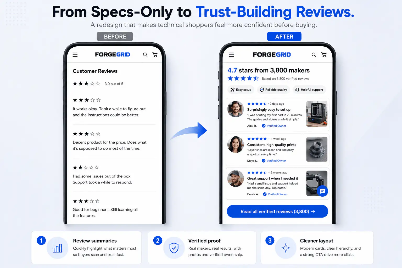
Why do specs fail to sell on Shopify product pages?
Specs fail when they make the buyer translate raw details into value. A line like 'ABS material, 1200mAh battery, multi-size' may be accurate, but it does not tell a cold buyer whether the product feels durable, fits their use case, lasts through a session, or is worth the price.
Shopify's product-description guidance pushes the same principle: address the ideal customer directly, answer the questions they ask, highlight benefits, include technical details, and avoid vague claims that create skepticism. The practical version is simple: every important spec should earn its place by reducing a buyer's uncertainty.
| Weak description | Buyer objection | Better description job |
|---|---|---|
| 100% cotton | Will it feel good and hold up? | Explain feel, weight, breathability, shrinkage, and care |
| Rechargeable battery | How long can I use it? | Give expected use time, charging behavior, and what is included |
| Water resistant | Can I use it where I need it? | Clarify real use cases and limits without overstating protection |
| One size fits most | Will it fit me? | Show measurements, body context, adjustability, and return reassurance |
| Premium quality | Why should I believe that? | Name the material, construction, testing, warranty, or proof cue |
Do not delete specs. Translate them. Buyers still need facts, but facts should be paired with the consequence they create for use, fit, comfort, durability, risk, or value.
What buyer objections should product descriptions answer first?
Start with the objections that stop a buyer before add-to-cart. In Shopify Community store-feedback threads, operators repeatedly mention low conversion with weak product-page clarity, generic descriptions, hidden shipping, thin proof, and product pages that do not answer basic questions. Those are copy problems as much as layout problems.
- What is this product, in plain language?
- Who is it for and who is it not for?
- What problem does it solve or what outcome does it create?
- Why is this version worth choosing over alternatives?
- What proof supports the claim?
- What does the buyer need to choose: size, color, bundle, variant, subscription, or add-on?
- What could go wrong after purchase: fit, delivery, return, care, compatibility, installation, warranty, or support?
- What should the buyer do next?
The order matters. A buyer should not see a long story before they know what the product is. They should not see a CTA before they understand the value. They should not discover return or delivery terms only after adding to cart.
How should you turn features into outcomes?
Turn a feature into an outcome by adding the buyer's situation. The formula is feature, meaning, use case, and confidence. For example, 'double-wall stainless steel' becomes 'keeps drinks cold during a commute without sweating onto your bag.' The feature stays, but now it answers why the buyer should care.
| Feature | Outcome copy | Where it belongs |
|---|---|---|
| Stretch fabric | Moves with you when sitting, bending, or walking | Near size/fit section |
| Ceramic coating | Wipes clean after daily cooking without aggressive scrubbing | Benefit bullets and care notes |
| USB-C charging | Uses the same cable as newer phones and laptops | What is included / setup section |
| Adjustable strap | Fits over light layers without changing the silhouette | Variant or fit guidance |
| Replaceable filter | Keeps the product useful after the first refill cycle | Maintenance and lifetime value section |
This is also how you avoid generic AI copy. 'Designed for everyday life' can apply to almost anything. 'The heel tab lets you pull the boot on without crushing the back when you are leaving quickly' describes a concrete moment.
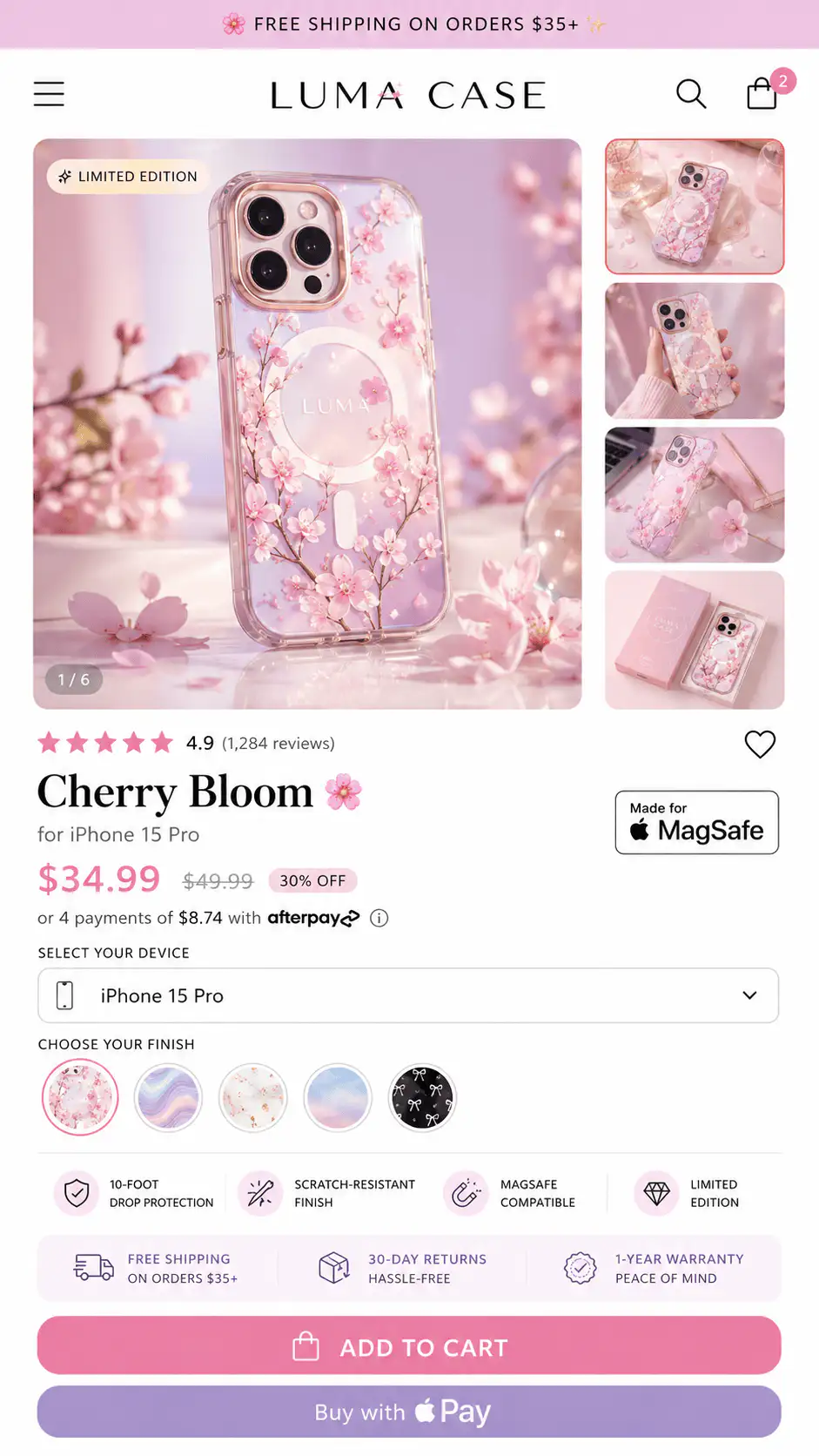
Where should objection-handling copy appear on the page?
Objection-handling copy should sit near the doubt, not only in a lower FAQ. If the buyer worries about fit while choosing a size, answer fit near the selector. If they worry about delivery before tapping the CTA, show delivery timing near the buy area. If a claim is bold, put proof beside the claim.
| Page moment | Buyer question | Copy that belongs there |
|---|---|---|
| First screen | Am I in the right place? | Product type, core promise, proof cue, price context, CTA |
| Benefit bullets | Why should I care? | Outcome-focused bullets tied to real use cases |
| Variant selector | Which option fits me? | Fit notes, size guidance, compatibility, variant differences |
| CTA area | What happens after I order? | Shipping, return, guarantee, payment, support, delivery cue |
| Proof section | Can I believe the claim? | Review snippets, UGC captions, before/after context, evidence limits |
| FAQ | What am I still unsure about? | Specific answers that did not fit cleanly near the decision point |
Baymard's product-page research frames the PDP as central to the buying decision and shows that many leading ecommerce sites still perform poorly on product-page UX. The implication for Shopify stores is not 'add more sections.' It is to make the answers easier to find before the buyer gives up.
What does good mobile product-description structure look like?
Mobile product descriptions need stricter sequence because the buyer sees one column. Desktop lets shoppers scan across image, buy box, tabs, and proof. Mobile forces the store to decide what comes first, what can wait, and what must stay near action.
- Product name that includes the product type, not only a branded label.
- One specific outcome line under the title.
- Proof cue such as rating, review count, result snippet, or credibility marker.
- Price and offer context.
- Variant or option guidance before the buyer chooses.
- Three to five benefit bullets tied to buyer use cases.
- CTA with shipping, return, guarantee, or delivery reassurance nearby.
- Deeper details, proof, comparison, care, and FAQ after the first decision area.
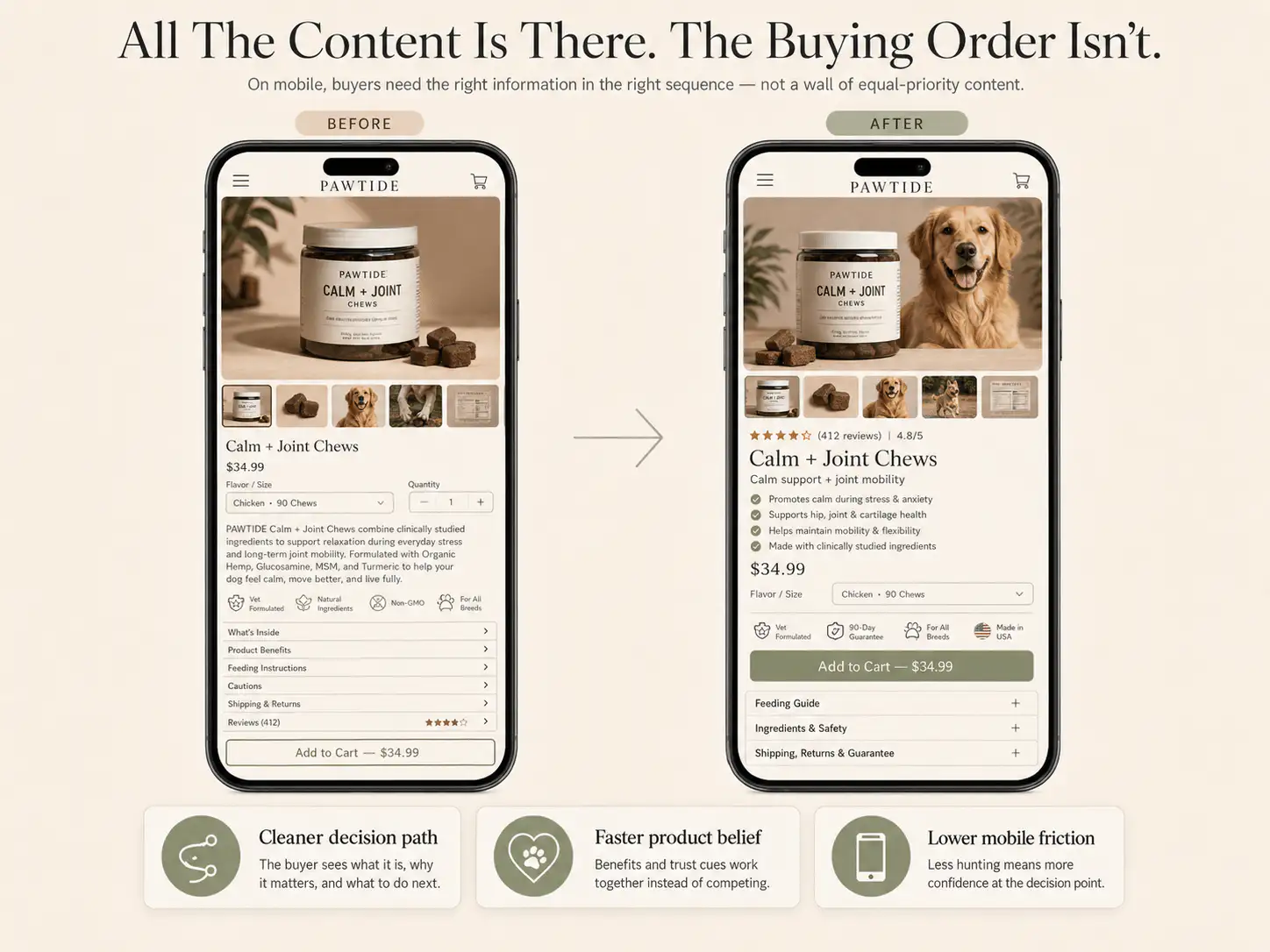
Open the PDP on a phone and stop after the first two screens. If the buyer can see price and CTA but not outcome, proof, option guidance, or risk reducer, the description is not doing its job early enough.
How should descriptions handle proof without overclaiming?
Product descriptions should make claims easier to believe, not louder. The stronger the claim, the closer the proof should sit. A pain-relief device, supplement, skincare product, or high-AOV item needs more support than a simple accessory. Unsupported superlatives create doubt.
- Pair result claims with review snippets, before/after context, usage timeframe, or expert explanation when available.
- Use exact language for materials, fit, dimensions, compatibility, and care.
- Avoid medical, guaranteed, or universal claims unless you can support them and comply with your category rules.
- Show the limits of the product when limits help trust.
- Do not replace weak proof with vague words like premium, professional, advanced, or best.
For AI-search readability, write proof in extractable sentences. 'Customers use this as a travel pouch because it fits a phone, passport, keys, and lip balm without bulging' is more useful than 'perfect for every adventure.'
When should specs, bullets, tables, and FAQs each be used?
Use each format for a different job. Bullets are for fast scanning. Tables are for comparison or choice. Paragraphs are for explaining context. FAQs are for remaining objections. Specs are for precise facts, but they should not carry the whole sales argument.
| Format | Best use | Bad use |
|---|---|---|
| Bullets | Benefits, quick proof, use cases, risk reducers | Dumping every feature without priority |
| Table | Sizes, compatibility, bundle differences, care, materials | Forcing simple benefits into a spreadsheet |
| Paragraph | Explaining the product story, outcome, or context | Long walls of copy before the buyer understands the product |
| Specs | Dimensions, materials, battery, ingredients, warranty, included items | Pretending raw data explains value by itself |
| FAQ | Objections that need direct answers | Hiding essential shipping, return, or fit info too low |
How can you audit a Shopify product description in 20 minutes?
A fast audit should compare copy against buyer doubts, not grammar. Pick one high-traffic or high-margin PDP. Read it on mobile. Then ask whether the page answers the decision questions before the buyer reaches the CTA, cart, or checkout.
- Circle every vague claim: premium, high quality, advanced, best, perfect, revolutionary.
- Write the missing proof beside each claim.
- Translate the top five specs into buyer outcomes.
- Move fit, compatibility, delivery, return, and guarantee answers near the relevant action.
- Replace supplier wording with buyer language from reviews, support tickets, search queries, and comments.
- Check whether the first two mobile screens explain product, promise, proof, option, risk, and CTA.
- Add one comparison table if buyers must choose between variants, sizes, bundles, or use cases.
- Add FAQ answers only for questions not already answered near the decision point.
The final question is blunt: if a cold buyer only read the current page, would they know enough to buy without opening Amazon, asking support, checking your return policy, or searching for a competitor?
Want the product-page doubts mapped?
If your PDP explains features but buyers still hesitate, get a Free Buying Journey First-Look. We will review the product description, proof placement, mobile order, and decision points before you rewrite the whole page.
FAQ
How long should a Shopify product description be?
Use as much copy as the decision needs, but do not force buyers through a long block. Simple products may need a short outcome line, bullets, and specs. Higher-risk products need fit, proof, comparison, shipping, returns, care, and FAQ answers.
Should product descriptions focus on benefits or features?
Use both. Features give buyers facts; benefits explain why those facts matter. The best product descriptions connect each important feature to a buyer outcome, use case, risk reducer, or comparison point instead of treating specs as self-explanatory.
Can AI write Shopify product descriptions?
AI can draft structure and variations, but it needs real inputs: customer language, exact specs, proof, policies, category rules, and product limits. Generic AI descriptions usually fail because they sound polished while skipping the objections that block purchase.
Where should shipping and returns appear in a product description?
Show short shipping, delivery, return, or guarantee reassurance near the CTA or option selector when those details affect confidence. The full policy can live elsewhere, but buyers should not discover important risk information only after reaching cart or checkout.
What is the fastest way to improve a weak product description?
Start by translating the top specs into outcomes, deleting vague claims, adding proof beside strong promises, and moving fit, delivery, return, and compatibility answers near the relevant decision point. Then check the first two mobile screens.
Sources and verification notes
- Shopify Help Center, Writing engaging product descriptions, retrieved 2026-07-10
- Shopify, How to Write a Product Description That Sells, retrieved 2026-07-10
- Baymard Institute, Product Page UX 2026: 10 Pitfalls and Best Practices, retrieved 2026-07-10
- Shopify Community, Best Ways to Improve Conversions on a New Shopify Store, retrieved 2026-07-10
- Shopify Community, Good FB metrics and no sales, retrieved 2026-07-10
- Shopify Community, Sales Drop Isn't Always an Ads Problem, retrieved 2026-07-10
- Shopify Community, Product page structure discussion, retrieved 2026-07-10