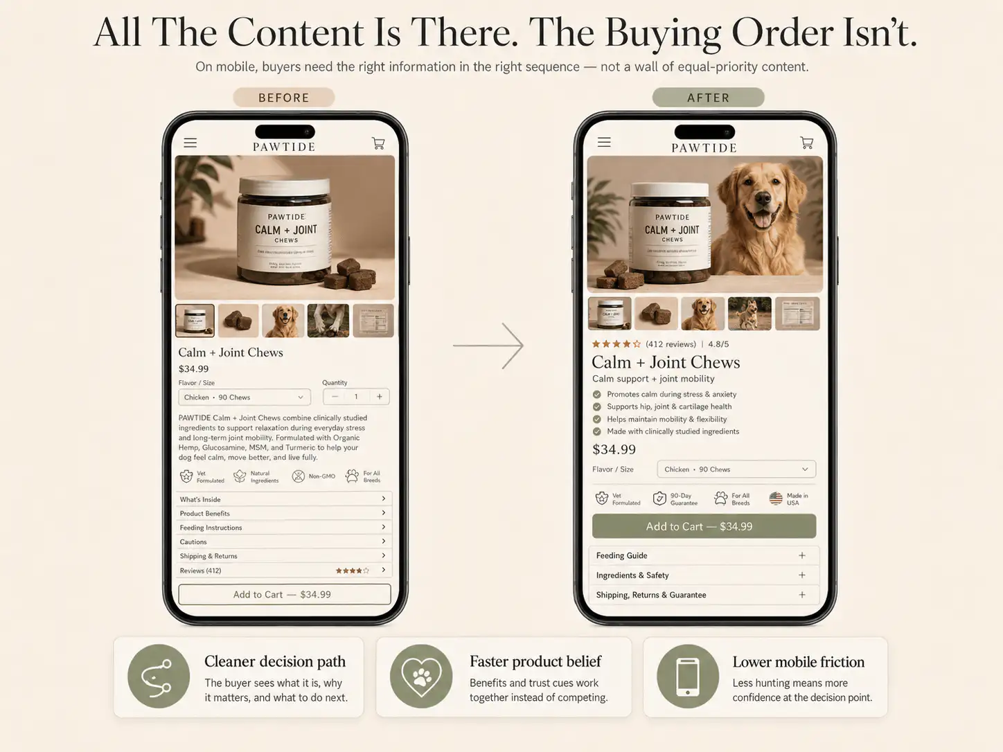
A buried buying section is a product-page layout leak. The page may have good images, proof, benefits, bundles, urgency, and FAQs, but shoppers still need a clear place to choose, understand price, add to cart, and recover momentum after reading.
- If shoppers struggle to find price, options, or Add to Cart, the page is creating action friction after it creates interest.
- Baymard's product-page benchmark found 62% of mobile ecommerce product-page experiences were mediocre or worse.
- A sticky CTA helps only when the buyer already understands the offer, selected options, and risk reducers.
- Long PDPs need repeated buying anchors, not one buy box buried below benefits, proof, bundles, and urgency blocks.
A buried buying section means the core purchase controls are hard to reach, recognize, or use at the moment a shopper is ready to act. On Shopify product pages, this usually happens when long benefit sections, image stacks, TikTok proof, review blocks, FAQs, bundle selectors, urgency timers, or trust icons separate the buyer from price, variants, quantity, shipping reassurance, and the Add to Cart button. The issue is not only button placement. It is decision timing. The page may persuade the shopper, then force them to hunt for the next action. A strong PDP keeps the buying controls close to the decision: visible early, repeated after proof, clear on mobile, and supported by the exact risk cues the buyer needs before checkout.
Some Shopify product pages look persuasive when you scroll through them slowly. They have benefits, review screenshots, comparison graphics, creator content, timers, bundles, and a long FAQ. The problem appears when a cold mobile shopper tries to buy quickly.
The buyer understands the product, but the buy box is not where the decision happens. Price appears in one place, bundle logic in another, proof elsewhere, and the CTA sits after a long content run. That creates a simple leak: interest without an obvious action.
Why does a buried buying section hurt conversion?
A buried buying section hurts conversion because the shopper has to restart the decision after every long scroll. Baymard's product-page benchmark found that 62% of mobile ecommerce product-page experiences were mediocre or worse. That matters because mobile buyers cannot scan sideways; they move through the buying argument in sequence.
In a March 2026 Shopify Community thread, one store owner reported ad clicks and add-to-carts but no sales. A reviewer noted that the actual buying area appeared only after many images, benefits, TikTok proof, reviews, and feature blocks. The page did not lack content; it lacked action rhythm.
What are the symptoms of a buried buy box?
The strongest symptom is not always low add-to-cart. Sometimes the page gets clicks, scrolls, and even add-to-carts, but buyers hesitate because the action zone feels complicated or arrives too late. Look for session recordings where users scroll past content, pause near images, then bounce before reaching options.
- Visitors repeatedly scroll up and down before adding to cart.
- Users tap images, reviews, or accordions but do not reach options.
- The price is visible early, but variants or bundles are much lower.
- The CTA appears only after a long stack of benefits or proof.
- A sticky CTA opens a drawer or scrolls to a confusing selector.
- Bundle, subscription, or quantity choices sit above the button without explanation.
- Urgency timers, payment icons, and trust badges compete with the primary action.
The practical check is simple: open the product page on a phone, start from the first image, and ask where the next real buying action appears. If the buyer must remember details from much earlier in the scroll, the page needs a cleaner buying anchor.
What should stay near the buying section?
The buying section should group the minimum information needed to choose and commit. Baymard's checkout research shows that extra costs, slow delivery, payment trust, return dissatisfaction, and unclear total cost are common abandonment causes. Several of those risks should be handled before the cart, not discovered at checkout.
| Element | Why it belongs near action | Weak version |
|---|---|---|
| Price and offer | The buyer needs the economic decision in view. | Discount math appears only in banners or cart. |
| Variants or bundles | The buyer must know what they are choosing. | Preselected bundles hide quantity or price changes. |
| Shipping or delivery cue | Late cost and timing surprises create hesitation. | Shipping appears only after checkout starts. |
| Returns or guarantee | Risk reversal matters before commitment. | Return policy sits only in footer legal copy. |
| Proof snippet | A quick trust cue supports the CTA. | Reviews live only in a long lower-page block. |
| Primary CTA | The next action should be visually dominant. | Timers, icons, and upsells compete with the button. |
Do not cram the entire page into the buy area. The goal is compression, not clutter. The buyer should understand the offer, select the right option, see the next cost or delivery cue, and know what happens if the product is not right.
When should a Shopify PDP repeat the CTA?
Repeat the CTA after a section changes the buyer's confidence. If a proof block, before-and-after section, comparison table, size guide, or FAQ answers a real objection, the next action should be close enough that the buyer can act without hunting back to the top.
- Show the primary buy area early, once the product and core promise are clear.
- Repeat a compact CTA after the first proof section.
- Add a buying anchor after comparison, fit, size, routine, or compatibility content.
- Place reassurance near the final CTA: shipping, returns, guarantee, support, or payment.
- Use a sticky CTA on mobile only if it scrolls to or opens a clear option state.
A repeated CTA does not need to be loud. It can be a small action band with product name, selected price, and Add to Cart. The important part is that every action point inherits the same clear offer state. If the sticky bar says one price and the bundle selector says another, trust drops.
When does a sticky Add to Cart help or hurt?
A sticky Add to Cart helps when the product has simple options and the buyer can act from any scroll depth. It hurts when the page has unresolved choices. If the shopper still needs size, color, bundle, subscription, personalization, or delivery context, a sticky CTA can make the page feel broken instead of faster.
| PDP situation | Sticky CTA decision | Reason |
|---|---|---|
| One product, one price, simple quantity | Usually useful | The CTA preserves momentum. |
| Size or fit uncertainty | Use with selector summary | The buyer needs option confidence first. |
| Bundles or subscriptions | Use carefully | The sticky state must show the selected offer. |
| High-AOV or risk-heavy product | Pair with reassurance | The CTA needs trust support. |
| Custom fields or paid add-ons | Avoid shortcut-only CTA | The buyer must understand what enters cart. |
On long PDPs, a sticky CTA should be a recovery tool, not a replacement for layout. If the main buy section is confusing, sticking the button to the bottom of the screen only makes the confusing state more available.
How should mobile order change on long PDPs?
Mobile order should make the buying controls feel like a recurring checkpoint. A desktop layout can place a gallery beside a buy box and let the shopper scan around. Mobile removes that freedom. The page becomes a single sequence, so a weak order creates more friction than the same content would create on desktop.
The first mobile screen should not be treated as a tiny hero section. It should identify the product, show one strong visual, make the promise clear, and give the buyer a route to price, options, and action. If the first action is hidden below long media or creator content, the page asks the shopper to commit attention before proving the buying path is easy.
| Mobile sequence | What it should answer | Common leak |
|---|---|---|
| First visual and title | What is this product? | Lifestyle image hides the actual item. |
| Promise and proof cue | Why should I care or believe it? | Reviews appear only after long content. |
| Price and options | What am I choosing and paying? | Variants sit below benefits or videos. |
| CTA and risk reducer | Can I act safely now? | Shipping and returns appear after cart. |
| Proof expansion | What removes my next doubt? | Proof is not followed by another action path. |
A good mobile PDP can still be long. The issue is not length by itself. The issue is whether each screen explains, proves, or enables the next step. If a section is only decorative, repeated, or disconnected from the purchase controls, it should move lower, shrink, or disappear.
What should not sit between proof and action?
Anything that does not answer the buyer's next question should stay out of the space between proof and action. This is where many Shopify pages lose momentum. A testimonial makes the buyer more confident, then the page inserts a brand story, ingredient essay, app-powered slider, or urgency widget before the buyer can act.
- Do not place a long founder story between a strong proof block and the next CTA.
- Do not put an upsell module above the first clear add-to-cart path.
- Do not use multiple urgency widgets around the same button.
- Do not make the buyer pass through a video section just to choose a variant.
- Do not hide the real return or delivery answer behind a collapsed footer link.
The cleaner alternative is to pair each persuasion section with an action. After reviews, show a compact buy anchor. After size guidance, show the size selector. After shipping reassurance, show the cart action. The page then feels like a guided buying path instead of a brochure with a button somewhere inside it.
How do bundles, timers, and badges bury the action?
Bundles, urgency, and trust badges bury action when they all compete for attention inside the buy area. Baymard's checkout abandonment data names trust, total cost, delivery speed, returns, payment methods, and errors as real buyer concerns. Generic icons cannot answer all of those concerns at once.
The common Shopify pattern is a product title, compare-at price, preselected bundle, countdown timer, payment icons, review stars, scarcity copy, payment message, and a button. Each element might have a reason. Together, they can make the next step harder to parse.
- If bundles are preselected, label quantity and savings plainly.
- If urgency is used, keep it secondary to price and action.
- If badges are used, pick the two or three that answer real risk.
- If payment messages appear, do not let them push the CTA down.
- If subscription is default, make one-time purchase easy to understand.
How should analytics diagnose this layout leak?
Use analytics to separate traffic mismatch from product-page action friction. In the source thread, the operator saw decent ad metrics and some add-to-carts, but recordings suggested people struggled with the product page flow. That is exactly where scroll depth, click maps, and event sequencing help.
| Signal | Likely interpretation | First check |
|---|---|---|
| High PDP views, low option interaction | The product is interesting but choices are unclear. | Variant and buy-section position |
| Scrolls past proof, no add-to-cart | Content builds interest but does not return to action. | CTA repeats after proof sections |
| Many CTA taps, few carts | The button or option state may be broken or confusing. | Theme/app behavior on mobile |
| Add-to-cart, low checkout start | Cart, cost, or reassurance may be weak. | Cart drawer/page and shipping cue |
| Checkout reached, no purchase | Late risk or payment friction is likely. | Delivery, returns, total cost, payment options |
Do not overread one recording. Look for patterns by device, traffic source, product type, and variant state. A paid social visitor may need a faster buy path than an organic search visitor reading a detailed comparison.
Also compare products with different option complexity. If simple products convert but bundled, sized, customized, or subscription products stall, the leak is probably not brand trust alone. It is likely the interaction between decision content and the controls needed to finish the purchase.
What is the best layout fix?
The best layout fix is usually to turn the PDP into decision loops: product clarity, buying anchor, proof, buying anchor, objection handling, buying anchor. This keeps the page useful for readers without making buyers hunt for the controls.
- Move product identity, price, selected option, and CTA into the first decision area.
- Add one short risk reducer near the first CTA: delivery, returns, guarantee, or support.
- Move long proof or feature stacks below the first buy anchor.
- Add a compact CTA after proof or comparison sections.
- Remove duplicate graphics that repeat the same claim without reducing doubt.
- Make bundle and subscription states readable before the button.
- Test the full path on a real phone, including cart and checkout.
Find the point where buyers lose the buy button
If your Shopify PDP has plenty of content but buyers still hesitate, get a Free Buying Journey First-Look. We will review the first screen, buy section, proof order, mobile sticky CTA, cart handoff, and checkout confidence path.
FAQ
Should the Add to Cart button always be above the fold?
Usually yes, but visibility alone is not enough. The first visible action area should also explain the product, price, options, proof cue, and one risk reducer. A button above the fold can still fail if the buyer does not understand what they are choosing.
Is a sticky Add to Cart good for Shopify product pages?
A sticky Add to Cart is useful when the product has simple choices or when the sticky bar clearly reflects selected options. It can hurt confidence when sizes, bundles, subscriptions, or add-ons are unresolved and the button shortcuts around information the buyer still needs.
How many CTAs should a long product page have?
Use enough CTAs that action is available after major confidence-building sections. A long PDP often needs an early buy area, one CTA after proof, and one near final reassurance. More buttons are not the point; timely buying anchors are.
What should be near the Shopify buy button?
Keep price, selected option, variant or bundle clarity, Add to Cart, a proof cue, and one or two risk reducers nearby. Shipping, delivery, returns, guarantee, or payment reassurance should appear close enough that buyers do not have to leave the decision area.
How do I know if the buying section is buried?
Check mobile recordings and event paths. If shoppers scroll heavily, pause near proof, move up and down, tap non-action elements, or never interact with variants and CTA, the buying section may be too low, too cluttered, or disconnected from the persuasive content.
Sources and verification notes
- Shopify Community, good Facebook metrics and no sales discussion, retrieved 2026-07-05
- Shopify Community, product page structure discussion, retrieved 2026-07-05
- Shopify Community, conversion advice for new Shopify stores, retrieved 2026-07-05
- Baymard Institute, current state of ecommerce product page UX, retrieved 2026-07-05
- Baymard Institute, cart abandonment rate research, retrieved 2026-07-05
- Shopify, product page optimization guidance, retrieved 2026-07-05