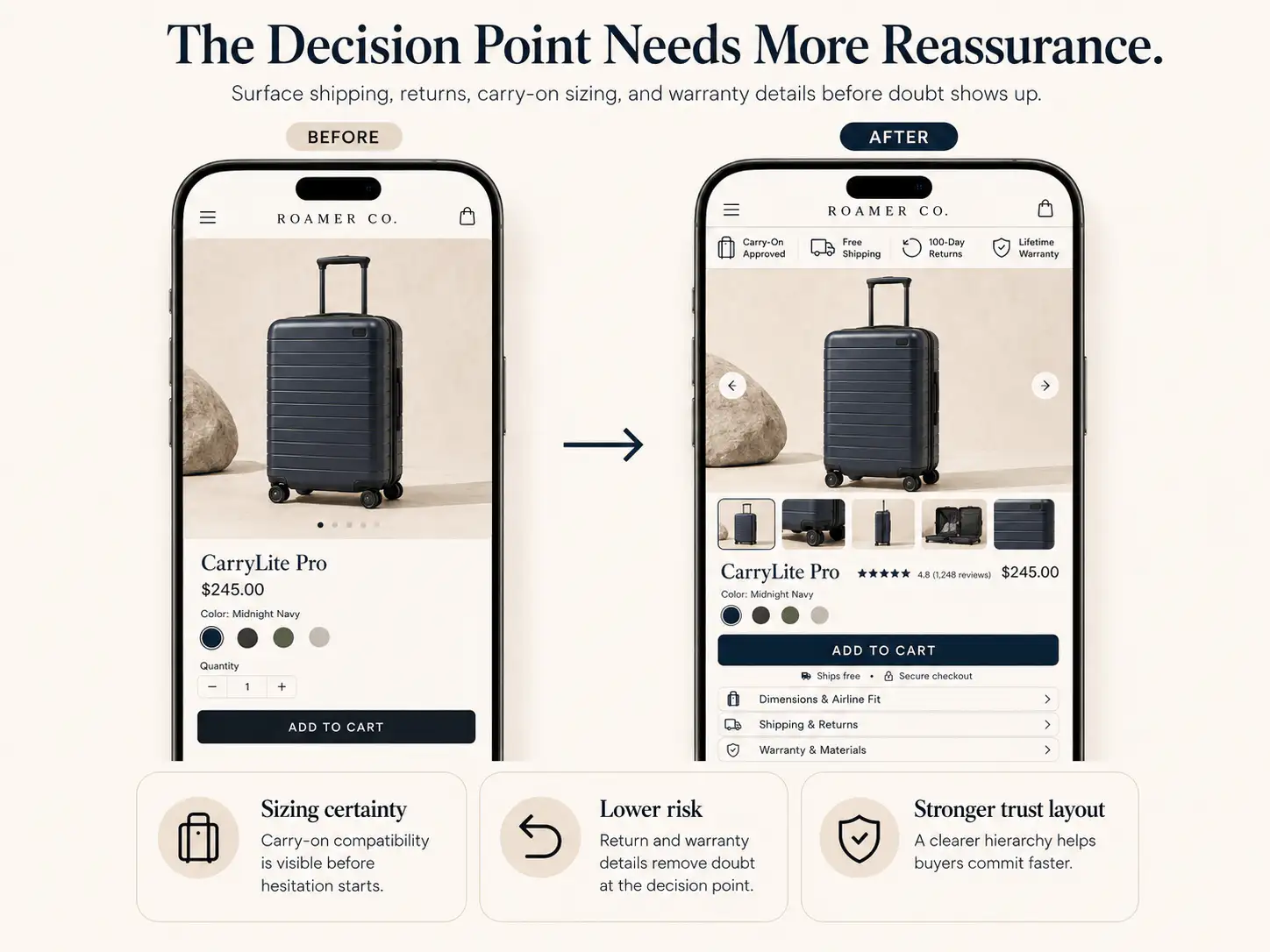
Reviews and proof work best when placed near the doubt they answer: claim proof near promises, fit proof near choices, return reassurance near the CTA, and deeper review content lower on the page.
- A single bottom review widget is not enough for most PDPs.
- Proof placement should match buyer doubt: quality, fit, results, safety, delivery, returns, or legitimacy.
- Use layered proof: early signal, claim support, objection support, deep review section, and cart reassurance.
- On mobile, do not hide every proof element below long descriptions or collapsed tabs.
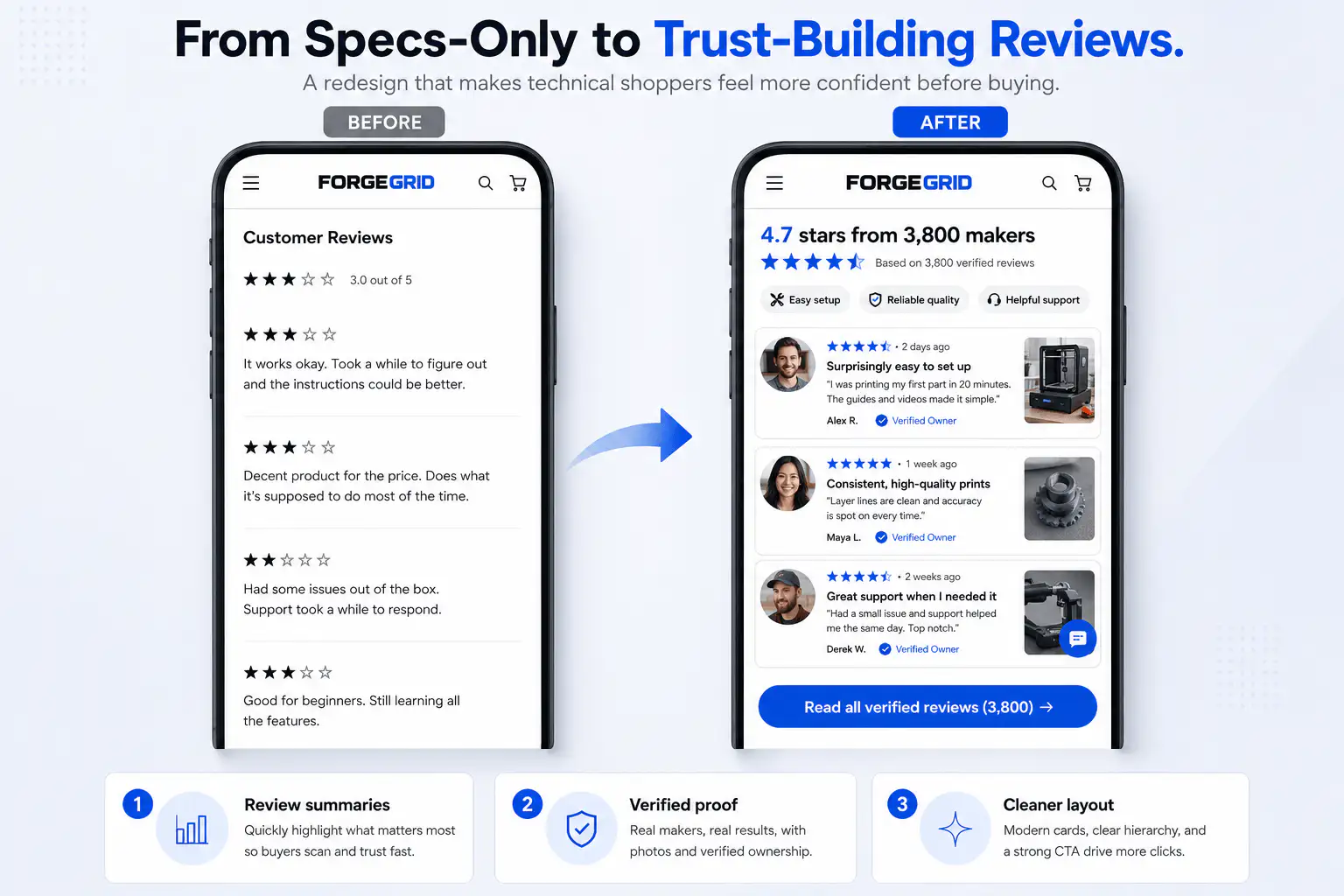
Reviews should appear in several places on a product page. Place a star rating or review count near the product title so buyers see immediate social proof. Add a short review snippet or customer-photo cue near the main product promise if the claim needs belief. Put specific proof near objections: sizing reviews near size selection, delivery comments near shipping, before/after proof near result claims, and guarantee or return reassurance near the CTA. Keep the full review section lower on the page for buyers who want depth, filters, photos, and detailed feedback. The best review placement matches the buyer's question at that exact point in the page.
Many Shopify stores install a review app, add a star widget near the title, place the full review block near the bottom, and consider the job done. That is better than having no reviews, but it misses how buyers actually build confidence.
What proof layers should a PDP use?
Immediate proof near the title
This is the fast credibility cue: star rating, review count, best-seller label, press mention, number sold, or verified buyer count. Its job is not to tell the whole story. Its job is to prevent the page from feeling unproven.
Claim proof near the promise
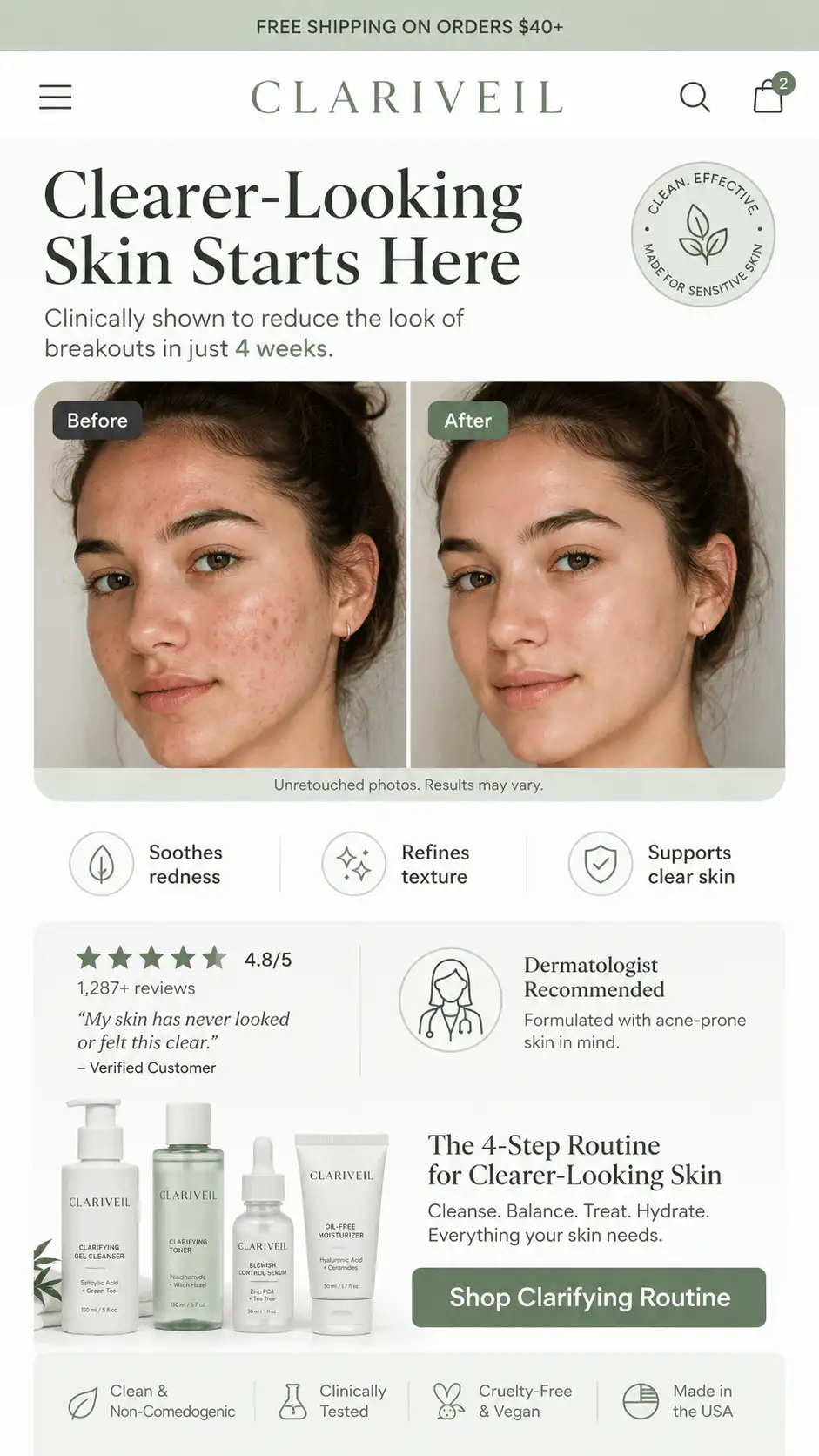
If the product makes a claim, proof should sit near that claim. If a skincare device promises visible glow, show before/after context, customer result snippets, usage timeframe, or expert explanation near that promise.
Objection proof near friction points
| Buyer doubt | Proof placement |
|---|---|
| Will it fit? | Near size selector or size guide |
| Is this safe for me? | Near ingredients, materials, certifications, warnings |
| Will it arrive in time? | Near delivery estimate or cart |
| Can I return it? | Near CTA and cart |
| Does it work for people like me? | Near benefit section or review filters |
| Is quality good? | Near materials, UGC, close-up images |
What proof should appear near the CTA?
- Star rating and review count.
- Free returns or guarantee.
- Secure payment note.
- Delivery estimate.
- Payment methods.
- Customer support cue.
- Short review line that supports the main promise.
How should proof placement change on mobile?
Mobile is where proof placement becomes unforgiving. Desktop buyers can scan around, but mobile buyers move through a strict sequence. Use proof in smaller layers: rating near title, short proof line before CTA, risk reducer below CTA, claim-specific proof in the next section, then full reviews after product education.
What if you do not have many reviews yet?
Do not fake reviews. If review volume is low, use honest alternatives: founder note, customer support guarantee, return policy, product demo, material transparency, early real customer quotes, UGC with permission, legitimate press, delivery clarity, and support information.
Want a proof placement review?
If your store has reviews but buyers still hesitate, the issue may be proof placement, not proof volume. Get a Free Buying Journey First-Look and we will map where trust should appear before the buyer reaches the CTA.
FAQ
Should reviews be above the fold?
A proof signal should appear above the fold or very early in the mobile sequence. The full review section can sit lower, but buyers should not have to scroll far before seeing evidence.
Are trust badges still useful?
They can help when the buyer doubts payment safety or store legitimacy, but generic badges do not fix weak product explanation. Use trust cues that match the real doubt.
Where should customer photos go?
Use a small customer-photo cue near the claim or image area if visual proof matters. Keep a deeper customer-photo review section lower on the page for shoppers who want more evidence.