A cart drawer is best when the product decision is simple and the buyer needs speed. A full cart page is better when the buyer needs reassurance, shipping clarity, bundling context, or a calmer final review before checkout.
- Use a cart drawer when the cart needs to keep momentum for simple, low-risk purchases.
- Use a full cart page when buyers need reassurance, shipping context, multi-item review, or stronger trust cues.
- Mobile cart UX should make quantity, discounts, shipping, payment, and checkout action obvious without visual clutter.
- Upsells help only when they support the purchase; they hurt when they interrupt checkout intent.
A Shopify store should use a cart drawer when buyers need a fast, lightweight path from product page to checkout and the purchase is easy to understand. A full cart page is better when buyers need to review multiple items, understand shipping, apply discounts, compare bundles, see guarantees, or feel more confident before paying. The decision should be based on buyer risk and mobile behavior, not theme defaults. If a drawer hides key costs or trust cues, it can feel fast but create abandonment.
Shopify cart UX often gets treated as a theme preference: drawer, page, popup, sticky checkout, or app-powered cart. The better question is what the buyer still needs after clicking add to cart.
Some buyers are ready to check out immediately. Others need to confirm total cost, delivery, payment method, discount, quantity, size, bundle contents, or return terms. If the cart flow does not match that state, the store either interrupts momentum or sends the buyer forward with unresolved doubt.
When does a cart drawer help conversion?
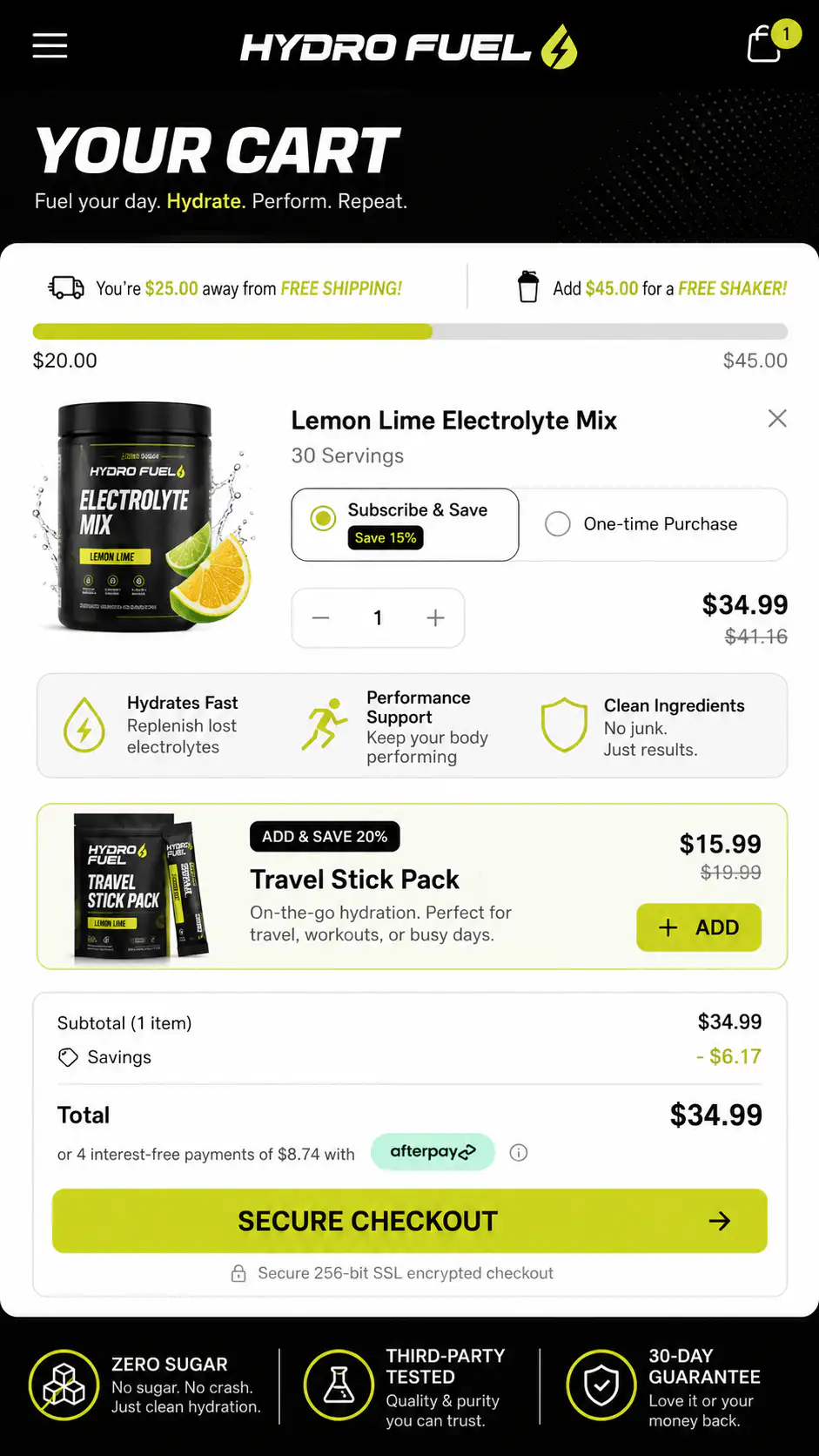
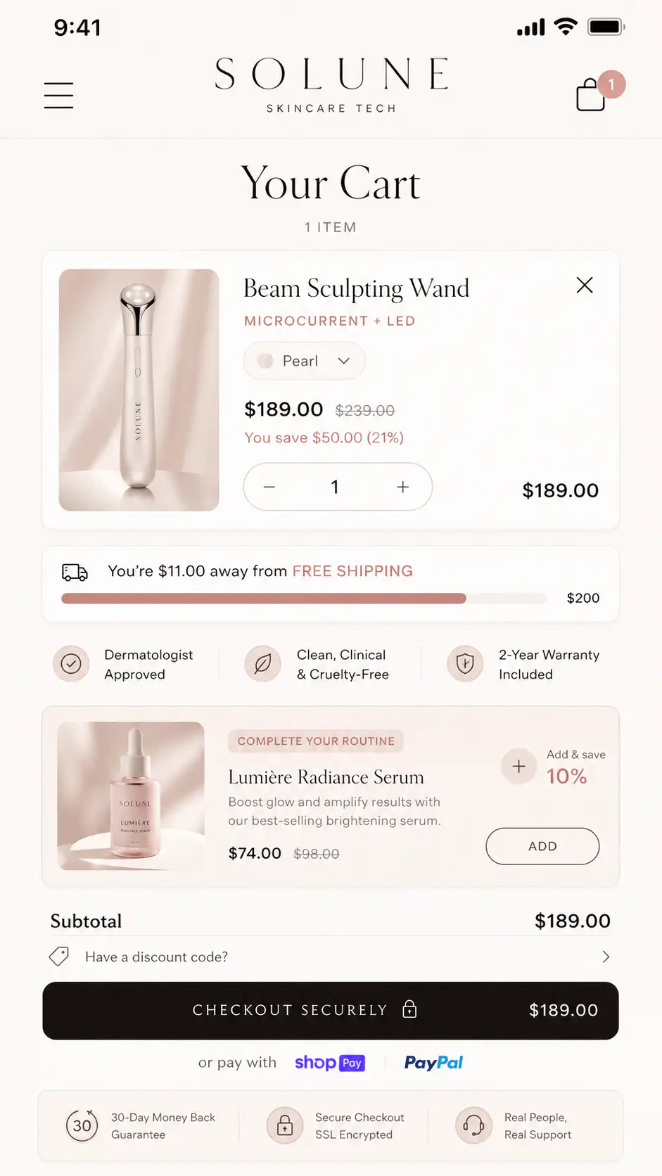
A drawer is useful when the buyer's next step should stay close to the product page. It confirms the item was added, keeps the context alive, and avoids forcing a full page transition. For lower-risk products, replenishment items, impulse purchases, or simple single-SKU stores, that speed can be valuable.
- The product is easy to understand.
- The buyer usually buys one item or one bundle.
- Shipping and returns are already clear on the PDP.
- The drawer shows subtotal, checkout button, and key reassurance immediately.
- Upsells are minimal and relevant.
- The drawer is easy to close without losing the selected product context.
When is a full cart page better?
| Buying situation | Better cart pattern |
|---|---|
| Simple single product, low risk | Cart drawer |
| Multiple products or bundles | Full cart page |
| High AOV or unfamiliar brand | Full cart page with trust cues |
| Repeat purchase or replenishment | Drawer or quick checkout |
| Size, variant, or subscription review | Full cart page |
| Strong free-shipping threshold behavior | Either, if threshold is clear |
What content belongs in the cart?
- Product name, image, selected variant, quantity, and price.
- Clear subtotal and discount behavior.
- Shipping threshold or delivery estimate.
- Checkout button visible without hunting.
- Return, guarantee, or secure payment reassurance.
- Payment methods when relevant.
- Relevant upsell only if it supports the order.
When do cart upsells hurt?
Upsells hurt when they interrupt a buyer who is already ready to pay. This is common on mobile drawers that stack progress bars, bundles, subscriptions, recommended products, gift options, review snippets, and checkout buttons into a cramped panel.
How should mobile cart UX behave?
| Mobile cart check | Pass condition |
|---|---|
| Checkout CTA | Visible, clear, and not pushed below clutter |
| Close/back behavior | Buyer can return to PDP without losing state |
| Quantity and variants | Easy to edit or verify |
| Shipping | Threshold or estimate appears before checkout |
| Discounts | Input or auto-apply behavior is understandable |
| Trust cue | Specific reassurance near CTA, not generic badge spam |
| Performance | Drawer/page opens quickly and does not jump |
Want a first look at your cart flow?
If your mobile cart gets opened but buyers do not finish, get a Free First-Look at the cart flow before adding another app. We will look at the drawer/page pattern, checkout momentum, trust cues, and mobile friction.
FAQ
Do cart drawers convert better than cart pages?
Not universally. Cart drawers can convert well for simple purchases because they preserve momentum. Full cart pages can work better when buyers need review, reassurance, shipping clarity, or multi-item context before checkout.
What should a Shopify cart drawer include?
A strong cart drawer should include product confirmation, selected variant, quantity, subtotal, checkout button, shipping threshold or delivery cue, and one relevant reassurance line. Avoid stacking too many upsells above checkout.
When should I use a full cart page?
Use a full cart page when the order needs review: multiple items, bundles, subscriptions, high AOV, sizing, delivery choices, discounts, or stronger trust cues before checkout.