
Pick the weak section
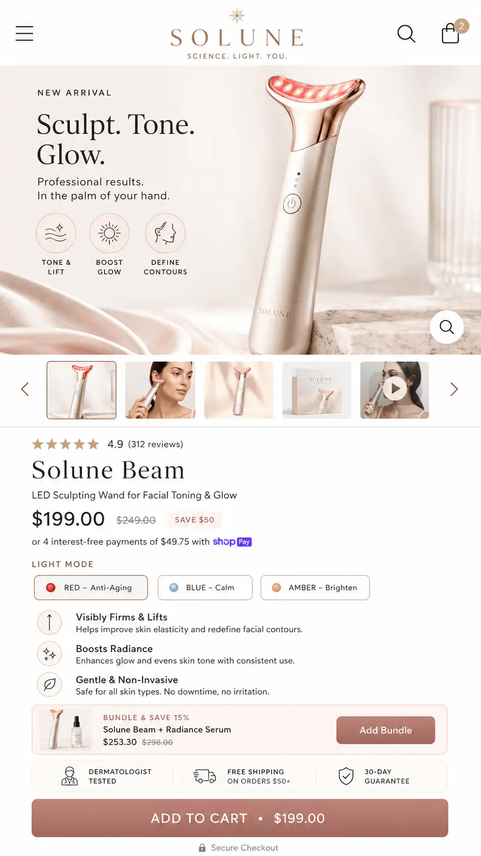
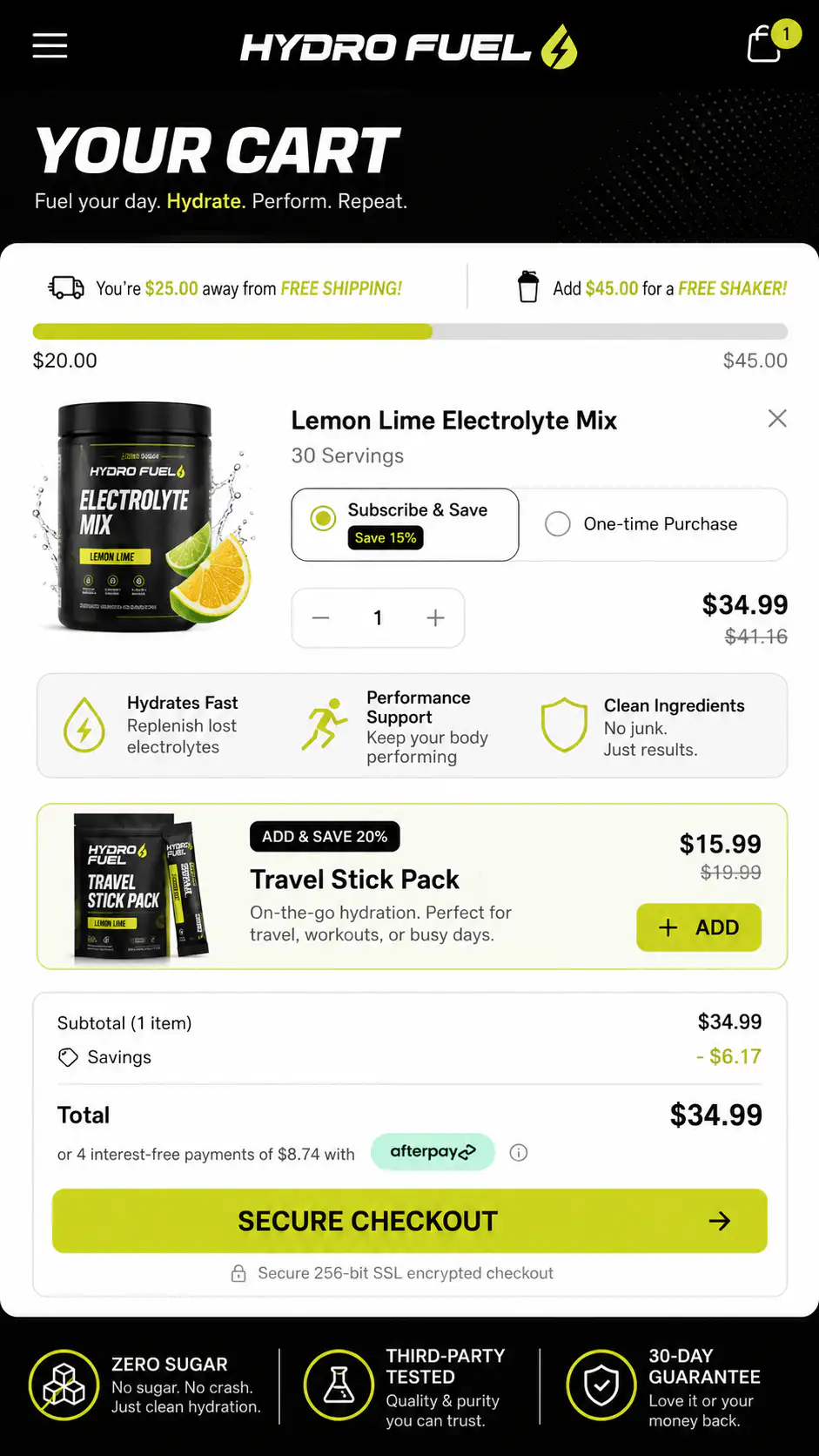
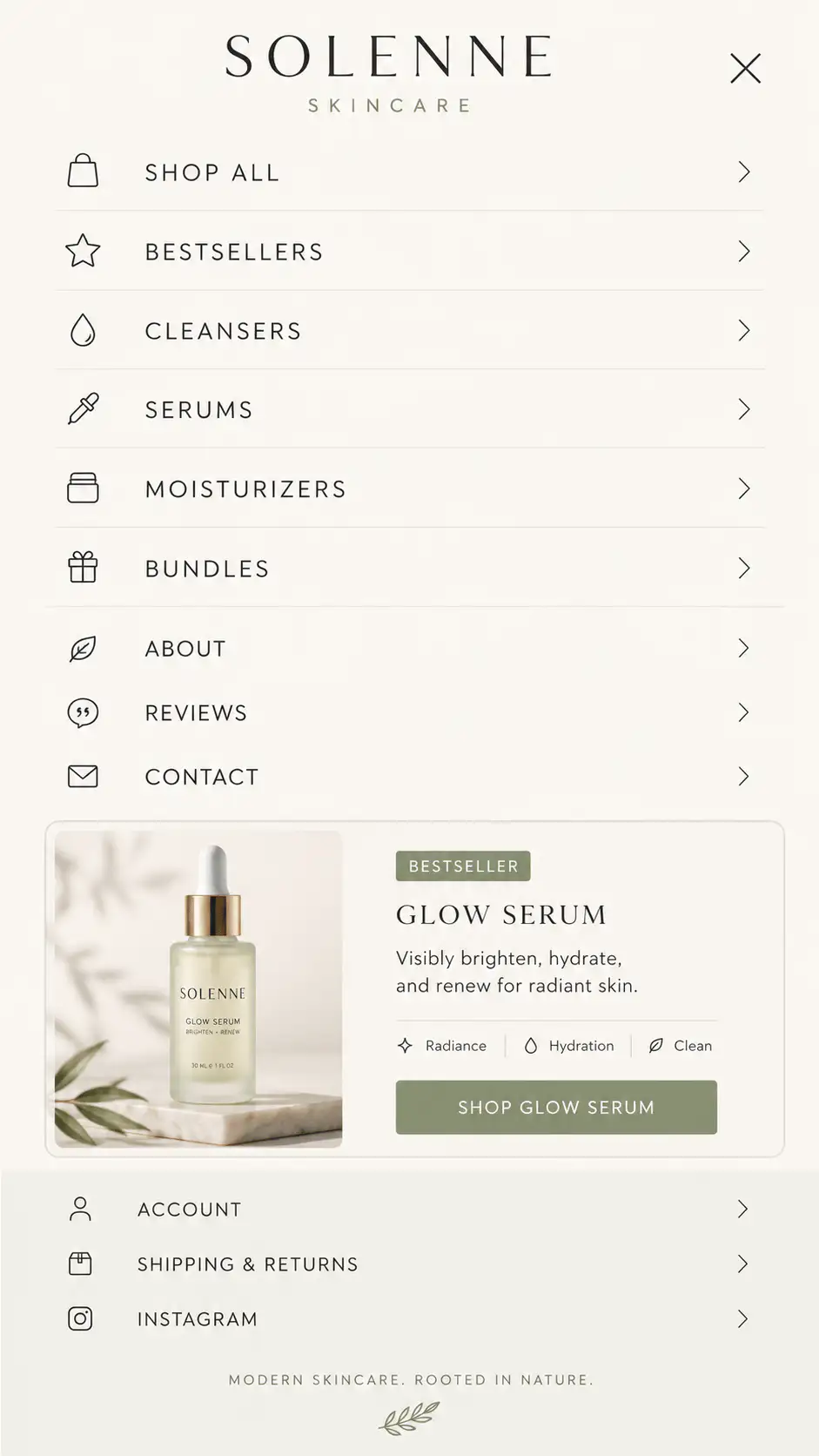
Hero, product page, cart, collection, mobile menu, or before/after offer block.
Private SectionLift Access
A practical visual library for founders, designers, and store owners who want weak store sections to feel more premium, clearer, and easier to buy from without starting from a blank page.
SectionLift helps you see what stronger ecommerce structure looks like, then use DTC Section GPT to turn your own screenshot into cleaner redesign directions.
Hero, product page, cart, collection, mobile menu, or before/after offer block.
Look at hierarchy, proof placement, product image, CTA, offer clarity, and mobile spacing.
Use a clean mobile screenshot when possible. Most ecommerce decisions happen there.
Ask the GPT for multiple premium DTC-style directions and use the best one as your brief.
Use these when the store looks fine, but the offer, product value, trust, and CTA do not land in the first 3 seconds.
Use these for weak above-the-fold structure, unclear benefits, buried proof, confusing variants, or CTA placement that asks before the buyer believes.
Use these when buyers add to cart, then stall because shipping, returns, trust, incentives, or next steps are not obvious enough.
Use these when the mobile menu is just links. Strong menus guide shoppers by category, intent, social proof, and clear paths.
Use these when category pages feel like plain grids. Better collection pages add context, buying guidance, filters, proof, and useful product framing.
Use these when people do not understand the outcome, mechanism, or reason the product is different from cheaper alternatives.
Best Practices
Premium is not "make it minimal." Premium is controlled hierarchy, believable proof, strong imagery, confident spacing, and fewer things fighting for attention.
Use Cases
Pick the reference category based on what is breaking in the buying journey.
Use hero, PDP, and collection references. Fix spacing, imagery, typography, and trust signals.
Use PDP references. Clarify product value, benefits, reviews, variants, and CTA placement.
Use cart references. Strengthen checkout clarity, delivery, returns, incentives, and guarantees.
Use before/after and offer sections. Show the result, mechanism, proof, and reason to believe.
Use mobile menu, cart, and PDP references. Mobile hierarchy matters more than desktop polish.
Checklist
If the answer is "no" to more than two of these, the section probably needs another pass.
Need done-for-you help?
I can help turn the direction into an actual Shopify store, product page, landing page, or full redesign system. Bring your store, your bottleneck, and the section type you want fixed first.