Field notes/Product Page & CRO
Shipping and Returns on Shopify PDPs: Where Reassurance Belongs
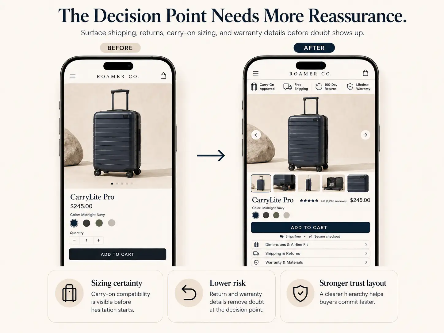
Shipping and return information should not wait until checkout. Place reassurance near the buyer's decision points so total cost, delivery timing, and risk feel clear before action.
Shipping, delivery, returns, exchanges, and payment reassurance are part of the buying argument, not footer paperwork. If shoppers discover cost, timing, or risk only after they add to cart, the store creates avoidable doubt at the exact moment it needs confidence.
Where should shipping and returns appear on a Shopify product page?
Shipping and return reassurance should appear close to the decisions they affect. Put a short delivery promise, shipping threshold, return window, exchange note, or payment reassurance near the main add-to-cart area. Add more specific details below the CTA, in accordions, in the cart, and on the full policy pages. The buyer should know the likely delivery timing, whether shipping is free or conditional, what happens if the product is wrong, and whether payment is safe before they reach checkout. A footer link alone is too late for most first-time buyers because the risk appears while they are evaluating the product, not after they have already decided to buy.
Key takeaways
- Shipping and return clarity should appear before checkout, not only in footer policy pages.
- The right placement depends on the buyer doubt: cost near price, timing near CTA, return risk near product choice, and detail in policy/FAQ.
- Late shipping surprises can look like checkout friction even when checkout technically works.
- Use short reassurance near action points and link to the full policy for buyers who need depth.
A Shopify product page can look convincing until the buyer asks one practical question: what happens after I click add to cart? If the answer is hidden, the page stops feeling like a buying path and starts feeling like homework.
This shows up in community threads constantly. Founders see visitors add to cart, reach checkout, or browse with intent, then leave. The suspected causes are often payment trust, shipping cost surprise, unclear delivery timing, weak return confidence, missing business information, or a store that feels too new to trust.
Why does late shipping information hurt conversion?
Late shipping information hurts conversion because it changes the deal after the buyer has already invested attention. The buyer thought they were evaluating a product at a visible price. Then cart or checkout reveals a delivery fee, slow timeline, unavailable shipping zone, confusing tax, or uncertain return path.
Even when the fee is reasonable, the timing creates doubt. The buyer is no longer asking whether the product is worth buying. They are asking why the store waited to tell them the real terms.
| Late-stage surprise | What the buyer may think | Where to handle it earlier |
|---|---|---|
| Shipping cost appears only at checkout | The advertised price was incomplete | Near price, CTA, and cart summary |
| Delivery timing is vague | I may not get this when I need it | Near CTA and shipping accordion |
| Returns are hidden in footer | If this is wrong, I am stuck | Below CTA and product-fit sections |
| Exchange policy is unclear | Sizing or variant choice feels risky | Near size, color, bundle, or custom option controls |
| Payment methods are vague | Will checkout support the method I trust? | Near cart and checkout buttons |
| Shipping zone fails at checkout | The store wasted my time | Shipping estimator, market copy, or product-page restriction note |
If a piece of policy information can change whether the buyer is willing to click add to cart, it belongs near the buying area in short form.
What reassurance belongs near the main CTA?
The main CTA area should not become a policy dump. It needs a compressed confidence layer: enough to remove the first risk without distracting from the purchase decision.
- Shipping threshold: Free shipping over $75, or calculated shipping shown before checkout.
- Delivery timing: Usually ships in 24-48 hours, or arrives in 3-5 business days for the main market.
- Return window: 30-day returns, easy exchanges, or final-sale clearly labeled before purchase.
- Payment confidence: Shop Pay, PayPal, Apple Pay, Klarna, cards, or local wallets if they matter to the market.
- Support access: A visible help link, chat, email, or fit support cue for products with higher risk.
- Policy link: A short link to full shipping and return details for buyers who need the fine print.
The wording should be concrete. 'Fast shipping' is weaker than 'Ships from the UK in 1-2 business days.' 'Easy returns' is weaker than '30-day returns on unworn items.' If the policy has exclusions, say the relevant version near the product instead of hiding the catch later.
How should PDP reassurance differ by product type?
Different products create different risk. A low-cost replenishment item may need a shipping threshold and subscription clarity. Apparel needs exchanges, fit risk, and return condition details. High-AOV products need payment confidence, warranty, support, and delivery protection.
| Product type | Main buyer risk | Reassurance to show early |
|---|---|---|
| Apparel | Wrong size, fabric feel, return hassle | Exchange window, size help, model context, return condition |
| Beauty or skincare | Will it work for me, can I return opened items | Skin-type guidance, return limits, support, usage timeline |
| Supplements | Safety, subscription terms, shipping cadence | Ingredient trust, subscription cancellation, delivery timing |
| Home goods | Size, material, delivery damage | Dimensions, material detail, returns, delivery handling |
| Gifts | Will it arrive in time | Order cutoff, gift note, delivery estimate, return/exchange rules |
| High-AOV devices | Payment risk, warranty, setup support | Warranty, support, financing, delivery and return process |
Where should the full shipping and returns detail live?
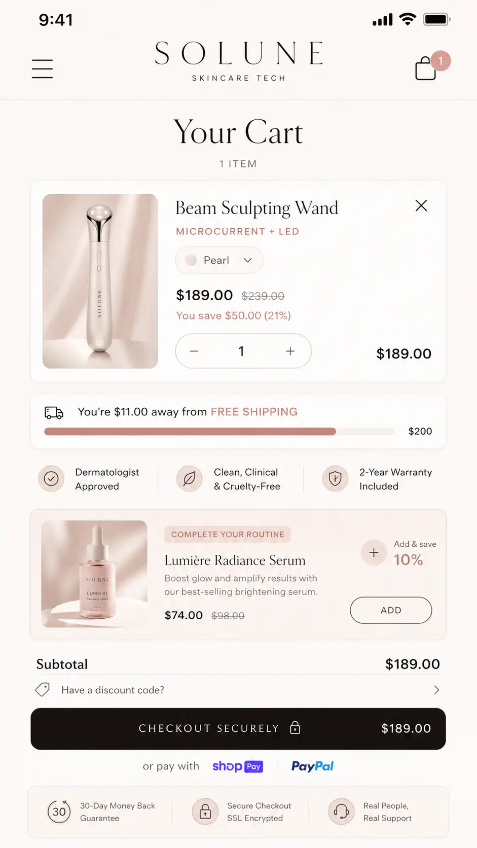
Full policy detail still matters. The mistake is relying on the full policy as the only reassurance. A strong Shopify store uses layers: microcopy near the CTA, summarized detail in the product page, cart reinforcement, and complete policy pages for verification.
- Near the product price: show the shipping threshold or calculated-shipping expectation.
- Near the add-to-cart button: show delivery timing, return window, and payment confidence.
- Near variant controls: show exchanges or fit support when the choice changes risk.
- In product-page accordions: explain shipping, returns, warranty, ingredients, sizing, care, or compatibility.
- In the cart: repeat the shipping threshold, delivery expectation, return note, and support access.
- On policy pages: give the legal and operational detail without making the buyer hunt for the basic answer.
This layered structure keeps the PDP scan-friendly while still being specific. First-time buyers get the reassurance they need to proceed. Careful buyers can verify the details. Support teams get fewer repetitive pre-purchase questions.
What should not be hidden in a footer policy?
Footer policies are necessary, but they are weak persuasion tools. Buyers rarely leave the product page, read a full policy, and return with more momentum. If the policy answer affects the immediate decision, surface the short answer on the page.
- Final sale or non-returnable product status.
- Return shipping paid by customer.
- Only store credit offered instead of refund.
- Long delivery windows or preorder timing.
- International shipping restrictions.
- Custom, personalized, hygiene, or opened-item exclusions.
- Subscription cancellation terms.
- Warranty or support limits for expensive items.
If a return rule is strict, make it clear before purchase. Hiding it may improve clicks, but it weakens trust, support quality, and repeat purchase potential.
How do shipping and returns affect cart abandonment?
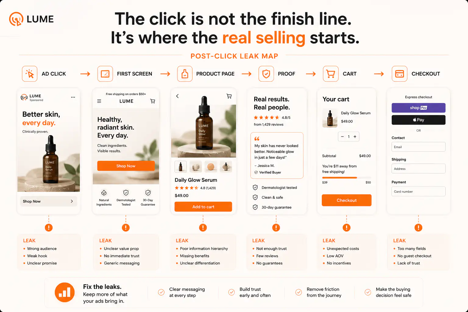
Shipping and return uncertainty often appears as cart or checkout abandonment because that is where the buyer finally sees the operational truth. The leak may start earlier. The PDP did not explain total cost, delivery timing, return safety, or payment confidence, so the buyer uses cart and checkout as a fact-finding tool.
That is why a high add-to-cart rate with weak purchases should not automatically be read as a checkout-only problem. The buyer may be adding to cart to inspect shipping, confirm payment methods, test a discount, or see whether the store feels legitimate enough to continue.
| Symptom | Likely reassurance gap | First fix |
|---|---|---|
| Add-to-cart is strong, purchases are weak | Cart reveals cost or risk late | Move shipping and return summary near CTA |
| Checkout starts are high, payment is weak | Payment confidence or total cost mismatch | Show wallet/payment methods earlier and test checkout routes |
| Mobile buyers drop after variant selection | Fit, exchange, or return risk is unresolved | Put exchange and fit reassurance near selectors |
| Support gets many pre-purchase shipping questions | Delivery detail is not visible enough | Add delivery estimates on PDP and cart |
| Discount buyers leave in cart | Shipping threshold or promo qualification is unclear | Show threshold, qualifier, and cart progress earlier |
How do you write reassurance without cluttering the page?
Use short, factual lines. The page does not need a paragraph about every policy. It needs decision-grade clarity. The full policy can carry the edge cases.
| Weak copy | Better copy |
|---|---|
| Fast shipping | Ships from California in 1-2 business days |
| Easy returns | 30-day returns on unused items |
| Secure checkout | Pay with Shop Pay, PayPal, Apple Pay, or card |
| Free shipping available | Free US shipping over $75 |
| Hassle-free exchanges | Free size exchange within 30 days |
| Contact us for help | Need sizing help? Email support before ordering |
The better versions are not longer for the sake of being longer. They are specific enough to answer the buyer's next objection. That specificity is what makes reassurance useful.
What should you check before redesigning the whole PDP?
Before rebuilding the page, run a reassurance audit. Many stores do not need a visual overhaul first. They need the buying controls, proof, policy microcopy, and cart state to stop contradicting each other.
- Open the PDP on a real mobile device and stop at the first CTA.
- Ask whether the buyer can see shipping cost logic, delivery timing, return window, and payment confidence before tapping.
- Check whether variant, size, bundle, subscription, or custom options change return or shipping risk.
- Add the product to cart and verify the cart repeats or clarifies the same promises.
- Start checkout and confirm no new surprise appears that should have been mentioned earlier.
- Review support questions, chat logs, abandoned checkout notes, session recordings, and customer emails for repeated policy confusion.
- Check whether your ad or landing page makes a shipping, return, or delivery promise the PDP does not confirm.
If the audit finds missing or inconsistent reassurance, fix that before testing button colors, adding urgency apps, or rewriting the entire product story. Reassurance gaps are often structural, but they are also concrete.
When should shipping and returns become part of the offer?
Sometimes shipping and returns are not just risk reducers. They are part of the offer. Free exchanges can matter for apparel. Fast dispatch can matter for gifts. Local shipping can matter for heavy products. Warranty can matter for devices. Subscription cancellation clarity can matter for replenishment.
When a policy changes the perceived value of the product, it should not sit below the fold as a quiet note. It should support the promise near the decision point, just like proof, price, and product images do.
- Use shipping as an offer when delivery speed is a reason to buy now.
- Use returns as an offer when size, fit, or compatibility creates hesitation.
- Use exchanges as an offer when the product has variants or personal preference risk.
- Use warranty as an offer when the product is expensive or technical.
- Use payment methods as an offer when the market expects wallets, BNPL, PayPal, or local methods.
If the policy makes the product easier to choose, show it as part of the product page. If it only handles rare edge cases, keep it in the policy page and link to it.
What is the fastest fix order?
Start with the information that removes the most doubt for the most buyers. Do not add every badge, accordion, icon, and policy block at once. That can make the page feel less trustworthy, not more.
- Write one short delivery line for the main market.
- Write one short return or exchange line for the product type.
- Show the free-shipping threshold or calculated-shipping expectation before cart.
- Add a payment-method cue only if the methods are real and available at checkout.
- Move product-specific exclusions out of the footer and near the relevant selector or CTA.
- Repeat the same promise in cart so the buyer does not feel the terms changed.
- Link every short claim to the full policy page for verification.
Want a clean read on your PDP trust gap?
If buyers like the product but hesitate before cart or checkout, get a Free Buying Journey First-Look. We will review where your page handles shipping, returns, payment confidence, policy clarity, and cart reassurance before you rebuild the whole store.
FAQ
Should shipping information be on every Shopify product page?
Yes, at least in short form. Buyers should see the main shipping promise, delivery estimate, threshold, or calculated-shipping expectation before they add to cart. The full shipping policy can live on a separate page.
Is a return-policy link in the footer enough?
No for most first-time buyers. The footer policy is useful for detail, but the product page should summarize the return window or exchange promise near the buying area when return risk affects the decision.
Where should delivery estimates appear on a PDP?
Place a short delivery estimate near the price, CTA, or shipping accordion. If timing depends on location, say that clearly and consider a cart or product-page estimator instead of pretending one estimate fits every buyer.
Should payment icons appear near the add-to-cart button?
Only when they match the actual checkout options. Payment icons can reassure buyers, but fake or unavailable methods create more doubt. Show wallets, PayPal, BNPL, or local methods when they are real decision factors.
Can shipping and returns fix low conversion by themselves?
Sometimes they remove a major blocker, but they are not a substitute for product clarity, proof, price logic, mobile UX, or traffic quality. Treat them as one part of the buying-confidence system.
Sources and verification notes
- Shopify Community, high add-to-cart and checkout but zero sales discussion, retrieved 2026-07-08
- Shopify Community, trust for a new clothing brand discussion, retrieved 2026-07-08
- Shopify Community, conversion improvements for a new Shopify store, retrieved 2026-07-08
- Shopify Community, store feedback and trust/payment suggestions, retrieved 2026-07-08