Shopify Dynamic Checkout Buttons: When Accelerated Payments Break the Buying Path
Dynamic checkout can shorten the path to payment, but it can also skip the exact cart, variant, and reassurance steps a shopper needs before buying.
Shopify dynamic checkout buttons are useful when the buyer is ready to purchase one clear variant immediately. They become risky when the store needs the cart to confirm bundle contents, personalization, shipping context, add-ons, discounts, or trust cues before checkout.
Should Shopify product pages use dynamic checkout buttons?
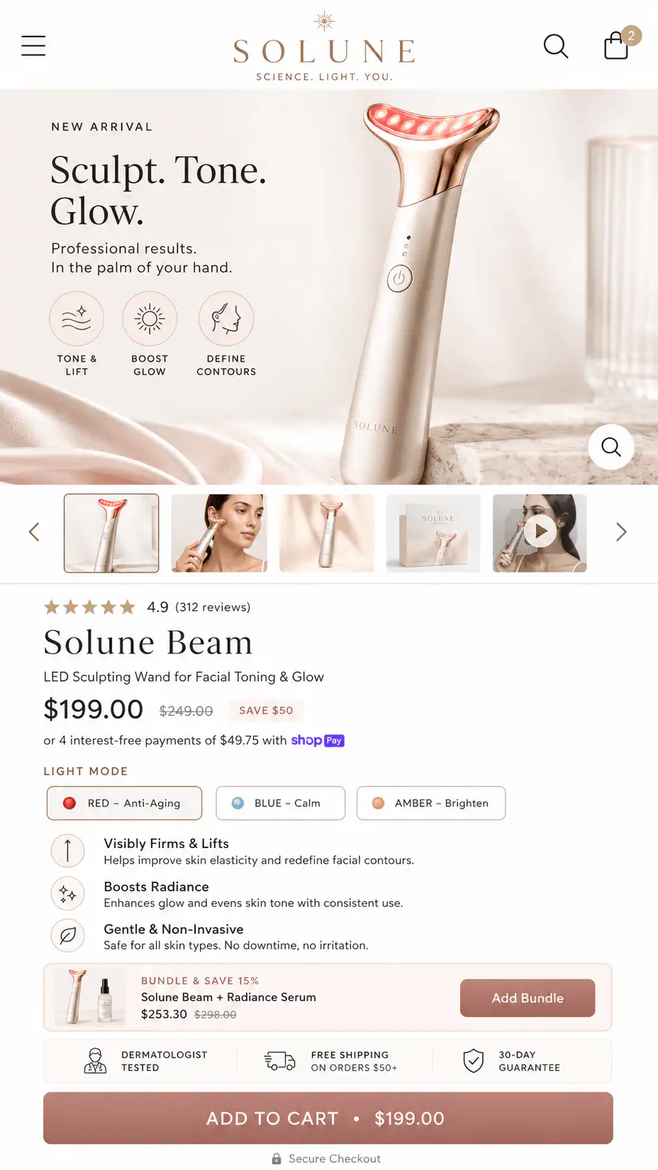
Shopify product pages should use dynamic checkout buttons only when skipping the cart helps the buyer complete one clear purchase without losing context. They work best for simple products, repeat purchases, urgent single-item buys, and shoppers who already know the offer. They can hurt the buying path when the cart needs to confirm variants, bundles, add-ons, subscriptions, discounts, delivery timing, gift notes, or trust cues before checkout. The decision is not whether accelerated payments are good. The decision is whether this product page needs an immediate checkout path or a cart review path before payment feels safe. Test both versions on mobile with real variants and payment methods: watch whether buyers using accelerated buttons pick the wrong option, skip add-ons or contact support more often. If the product needs explanation before payment, keep the main add-to-cart button dominant and show express payment later in the cart or checkout.
Key takeaways
- Dynamic checkout buttons skip the cart, so they can remove useful buying context as well as friction.
- Shopify says product-page accelerated checkout can purchase only one variant combination.
- The wallet button a shopper sees can change by payment setup, Shop Promise, browser, device, and payment history.
- Keep dynamic checkout when the product is simple and low-context; remove or demote it when cart review, options, shipping, or proof must happen first.
- Use payment trust icons and clear button hierarchy when shoppers need wallet confidence but not a cart bypass.
Shopify dynamic checkout buttons look like a clean conversion shortcut. A shopper can bypass the cart, use a known wallet, and reach payment faster. That sounds useful, especially on mobile where every extra step can feel expensive.
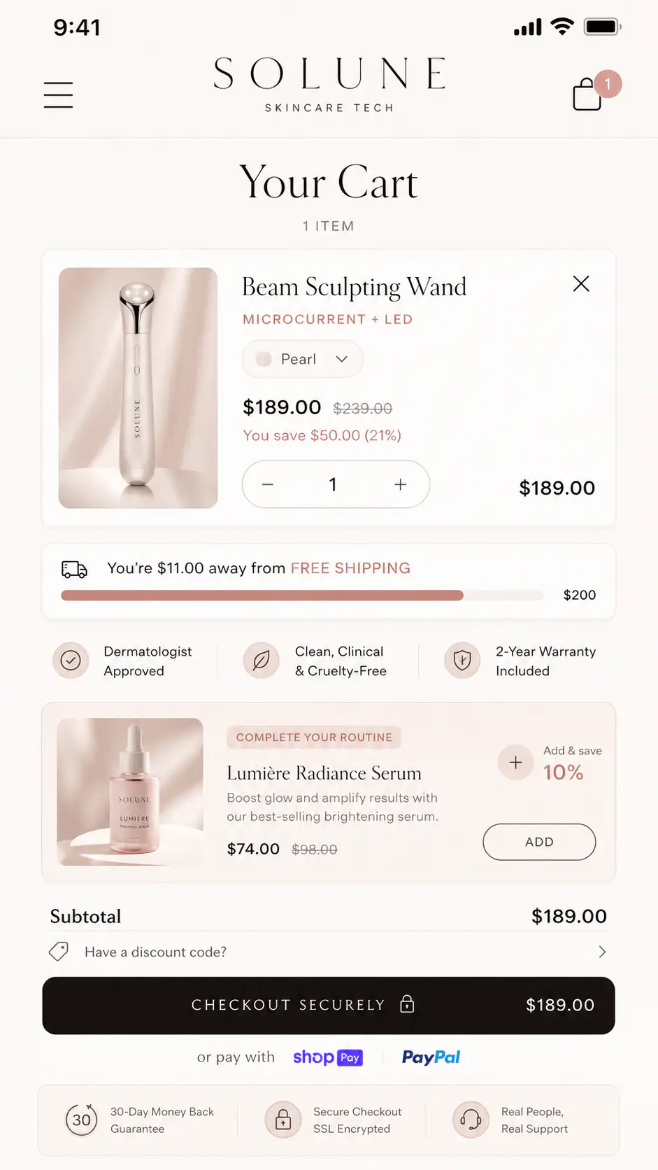
The catch is that the cart is not always friction. For many stores, the cart is where the buyer verifies quantity, selected variant, discount, delivery promise, bundle contents, payment methods, and final confidence. Removing that step can make a simple purchase easier or make a complex purchase feel uncontrolled.
What does Shopify dynamic checkout actually do?
Shopify describes accelerated checkout buttons as a way for customers to proceed directly from a product page to checkout. The button can be unbranded, such as Buy it now, or branded with a wallet such as Shop Pay, Apple Pay, Google Pay, PayPal, Amazon Pay, or another enabled method.
The important operational detail is that product-page accelerated checkout is a single-product path. Shopify's help documentation says customers can purchase only single variants of a product through the product-page accelerated checkout flow. That matters if the buyer still needs to compare sizes, combine variants, add accessories, use a bundle builder, or review a mixed cart.
Dynamic checkout is not just a faster button. It is a different buying path. It decides whether the buyer reviews the cart before checkout or skips straight toward payment for the selected product state.
When do dynamic checkout buttons help?
Dynamic checkout helps when the buyer has enough information and the order is simple. In that case, the cart may add little value. A repeat buyer purchasing a refill, a shopper buying one clear gift, or a buyer who came from a specific ad for one SKU may benefit from a shorter path.
| Good fit | Why it works | What to verify |
|---|---|---|
| Single-SKU product | There is little risk of buying the wrong option | Selected quantity and variant are obvious |
| Repeat purchase | The buyer already knows the product and risk | Wallet, shipping, and account behavior still work |
| Low-consideration item | Cart review may add unnecessary delay | No important offer or bundle info is skipped |
| High-urgency purchase | Speed may preserve intent | Delivery, returns, and trust are visible before the button |
| One-product store | The cart often duplicates checkout context | The product page handles all objections before checkout |
When do accelerated buttons hurt the buying path?
Accelerated buttons hurt when they move the shopper forward before the store has resolved what the buyer is actually buying. The problem is not the payment method. The problem is skipped context.
- The product has important variant choices and the button can be tapped before the buyer understands the option.
- The store sells bundles, routines, kits, or accessories that are normally reviewed in cart.
- The buyer needs to confirm personalization, engraving, uploads, gift notes, or add-ons.
- Discounts, free gifts, shipping thresholds, or subscription details become clear only in cart.
- The product page relies on the cart for delivery estimates, return reassurance, payment icons, or support cues.
- The wallet button changes by device and creates a different CTA than the team expected.
- The product is frequently bought with other items and bypassing the cart lowers order context or AOV.
This is why an A/B test from another store is only directional. One public Reddit post described add-to-cart beating dynamic checkout in a small test, while replies argued the sample was too small and that the right answer depends on product type. That is the useful lesson: do not copy the result. Copy the diagnostic method.
Why does the button change by device or shopper?
Shopify's documentation says the accelerated checkout button shown to a customer can depend on payment settings, whether Shop Promise is active, the customer's browser, device, and personal payment history. That means the button your team sees during desktop QA may not match what a buyer sees on Safari, Chrome, iPhone, Android, or a logged-in Shop Pay session.
| Symptom | Likely issue | Better fix |
|---|---|---|
| Only Shop Pay appears on the PDP | Product-page accelerated checkout is prioritizing one eligible button | Show accepted payment icons near the buy area |
| Apple Pay or Google Pay appears only in checkout | Wallet eligibility depends on device, browser, and setup | QA on real devices and explain payment options before checkout |
| Merchant wants all wallet buttons on PDP | Shopify controls product-page accelerated button display | Use cart/checkout express buttons plus static trust cues |
| CTA label changes across devices | Branded buttons are dynamic by design | Make add-to-cart the stable primary path if consistency matters |
| Button bypasses cart review | Accelerated checkout is doing its job | Remove or demote it when cart context is needed |
How should you decide: add to cart, buy now, or dynamic checkout?
Use a buyer-path decision, not a theme preference. The button hierarchy should match how much confirmation the shopper needs between product interest and payment.
| Product situation | Primary button | Secondary path |
|---|---|---|
| Simple product, one clear variant | Dynamic checkout or Buy it now | Add to cart for shoppers who want to continue browsing |
| Multiple variants with meaningful differences | Add to cart | Dynamic checkout only after variant state is clear |
| Bundle, kit, or routine | Add to cart or bundle builder | Checkout after cart confirms the set |
| Personalized product | Add to cart | Checkout only after option summary is visible |
| Subscription or prepaid offer | Add to cart | Checkout after billing cadence and cancellation terms are clear |
| High-AOV product | Add to cart with reassurance | Dynamic checkout only if proof and policies are visible near CTA |
| One-product landing page | Buy now or dynamic checkout | Cart path if accessories, warranties, or gifts matter |
If the buyer needs to review what changed before paying, keep add-to-cart as the stable primary action. If the buyer only needs to pay for the selected item, accelerated checkout can be tested.
What should you QA before keeping dynamic checkout?
- Test the default variant, a non-default variant, and an unavailable variant if relevant.
- Change quantity and confirm whether accelerated checkout respects it.
- Select each subscription, bundle, personalization, or add-on state.
- Check whether discounts, free gifts, and shipping thresholds still make sense when cart is skipped.
- Open the PDP on iPhone Safari, Android Chrome, desktop Chrome, and at least one private session.
- Confirm which branded wallet appears on the PDP, cart, and checkout.
- Place a test order or use a payment test mode where safe for the store.
- Review analytics separately for add-to-cart, checkout start, purchase, AOV, and support tickets.
Where should payment trust appear if dynamic buttons are removed?
Removing product-page accelerated checkout does not mean hiding payment confidence. If buyers care about Apple Pay, Google Pay, Shop Pay, PayPal, or card security, show that reassurance near the buy area without forcing the wallet button to be the main action.
- Place accepted payment icons below or near the primary CTA.
- Keep the CTA label stable: Add to cart, Buy now, or Choose options.
- Explain checkout confidence in plain language for high-risk products.
- Use cart and checkout to show the full set of express payment options.
- Avoid overloading the button area with badges, app widgets, and competing CTAs.
This solves a common merchant concern from community threads: shoppers need to know their preferred wallet is accepted, but the store may not need every wallet button on the product page. Payment confidence and payment bypass are different jobs.
How should you measure the button decision?
Measure the button decision by the whole order path, not only clicks. A faster checkout start can still be worse if AOV drops, support questions rise, variant mistakes increase, or shoppers abandon because shipping and discount context was skipped.
| Metric | What it tells you | What can mislead you |
|---|---|---|
| Add-to-cart rate | Whether the PDP creates enough intent to continue | Dynamic checkout may skip this event |
| Checkout start rate | Whether shoppers move toward payment | A high start can hide later doubt |
| Purchase rate | Whether the full path works | Small samples can overstate button differences |
| AOV | Whether cart bypass changes multi-item behavior | Higher conversion with lower AOV may not be better |
| Support tickets | Whether shoppers understand the order | This may lag behind the test window |
| Refunds or edits | Whether buyers chose the wrong option | Low volume makes this noisy |
If traffic is low, do not pretend a tiny split test is conclusive. Use QA evidence, Shopify funnel behavior, customer support questions, and order quality to decide whether dynamic checkout should remain prominent.
What is the safest default for most Shopify PDPs?
The safest default is a clear Add to cart button as the primary action, with payment trust cues nearby, and accelerated checkout tested only where the product path is simple enough to support it. That keeps the buyer in a stable flow while preserving the option to shorten payment for products where speed truly helps.
This is not anti-Shopify or anti-wallet. Shop Pay, Apple Pay, Google Pay, and PayPal can be excellent checkout accelerators. The point is that product-page button hierarchy should be designed around buyer confidence, not around the assumption that fewer steps always means more purchases.
Unsure whether your PDP should use dynamic checkout?
If your product page has the right traffic but the button flow feels messy, get a Free Buying Journey First-Look. We will review the product-page CTA, variant state, cart context, and checkout path before you rebuild the page or remove useful payment options.
FAQ
Do Shopify dynamic checkout buttons improve conversion?
They can improve conversion when the product is simple and the shopper is ready to buy one selected item immediately. They can hurt when the cart needs to confirm variants, bundles, personalization, discounts, shipping, or trust cues before checkout.
Can Shopify show all accelerated checkout buttons on the product page?
Shopify controls which product-page accelerated checkout button appears. The visible button depends on payment setup and shopper context. Stores that need broader payment reassurance can show payment icons near the CTA and let cart or checkout show the available express options.
Should I remove Shop Pay from my product page?
Remove or demote product-page accelerated checkout only when it conflicts with the buying path. If buyers need cart review, variant confirmation, or shipping context, make Add to cart primary. If the product is a simple one-item purchase, test before removing it.
What is the difference between Buy it now and Add to cart?
Buy it now sends the selected product toward checkout faster. Add to cart lets the shopper review the order, add more products, confirm discounts, see shipping context, and keep browsing. The right button depends on how much confirmation the buyer needs.
How should I test dynamic checkout on Shopify?
Test by product type, device, browser, payment method, variant, quantity, cart behavior, checkout start, purchase rate, AOV, and support issues. Do not rely on one desktop view or a small conversion sample to make a universal decision.
Sources and verification notes
- Shopify Help Center, Accelerated checkout buttons, retrieved 2026-07-14
- Shopify Community, Issue with customizing Dynamic Checkout Button styling, retrieved 2026-07-14
- Shopify Community, Accelerated Checkout Buttons on Product Page, retrieved 2026-07-14
- Reddit r/shopify, dynamic checkout A/B test discussion, retrieved 2026-07-14