Field notes/Product Page & CRO
Shopify Product Tabs on Mobile: When Hidden Details Stop Buyers From Deciding
Product tabs and accordions can keep a mobile PDP tidy, but they become a conversion leak when sizing, ingredients, shipping, returns, compatibility, or proof are hidden before the buyer has enough confidence.
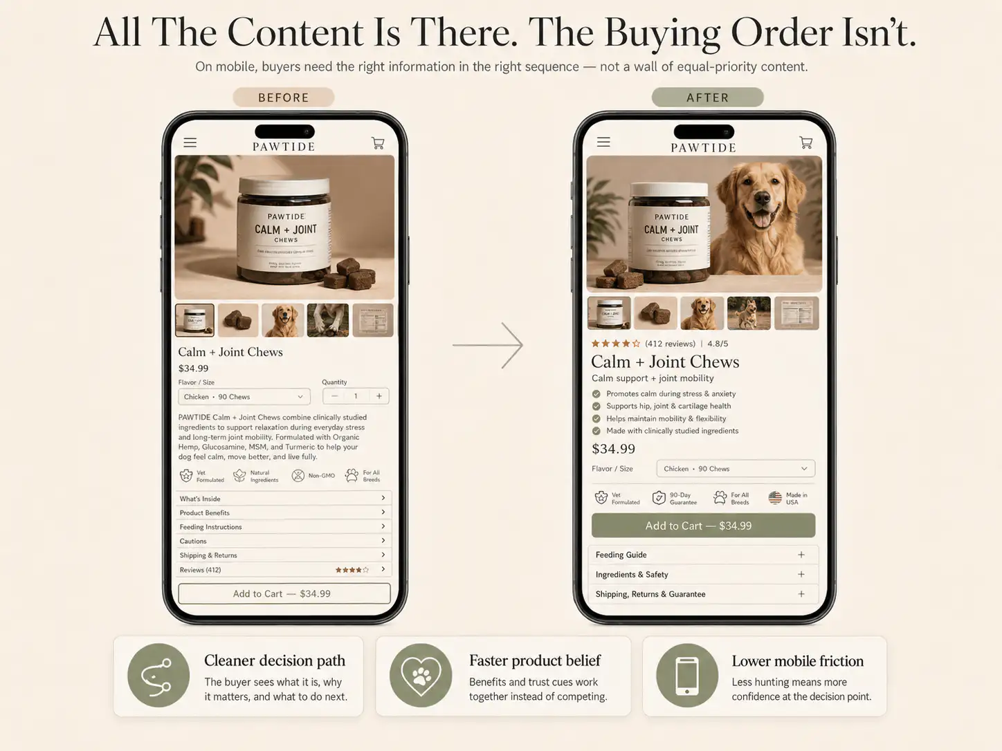
Mobile product tabs are useful only when they organize secondary detail after the buyer already understands the product, promise, proof, risk, and next action. If tabs hide the information shoppers need before add-to-cart, they make the page look cleaner while making the decision harder.
Should Shopify product details be hidden in mobile tabs?
Shopify product details should only be hidden in mobile tabs when the buyer can still understand the product, believe the promise, choose the right option, and see purchase risk before opening anything. Put decision-critical information in the visible mobile flow: what the product is, who it fits, why it works, key materials or specs, delivery, returns, guarantee, review proof, and variant guidance. Use accordions for deeper details, long specifications, shared policies, care instructions, ingredient lists, compatibility notes, or FAQ content after the main decision has enough context. If a shopper must expand several panels before they know whether the product fits their need, the tabs are hiding the sale. Check the mobile page with every panel closed: if a first-time buyer could not decide from what stays visible, move that content out of the tab.
Key takeaways
- Tabs and accordions are an organization pattern, not a fix for weak PDP hierarchy.
- Keep decision-critical details visible before or near the CTA: fit, compatibility, materials, delivery, returns, guarantee, and proof.
- Use collapsed sections for supporting depth, shared policies, long specifications, and reference content after the core buying argument is clear.
- Audit mobile tabs after theme, app, and metafield changes because hidden or empty panels can remove the only evidence buyers needed.
A short mobile product page can feel like good UX. The page looks clean, the buy button appears faster, and the description no longer pushes the CTA down the screen. But a shorter PDP is not automatically easier to buy from.
The risk is simple: the theme hides the exact information the shopper needed to justify the next tap. The buyer sees title, image, price, variants, and CTA, but not the fit note, compatibility warning, return reassurance, ingredient concern, delivery promise, review context, or proof that makes the product believable.
When do mobile tabs become a conversion leak?
Mobile tabs become a leak when they hide information that should have appeared before the buyer reached the CTA. This is common after a store migrates themes, adds a product-tab app, moves details into metafields, or copies a desktop layout into a narrow mobile flow.
- The first visible product copy is only brand language, not product explanation.
- Size, fit, compatibility, or material context sits inside a closed accordion.
- Shipping, returns, or guarantee details appear only below several panels.
- Customer proof is separated from the claim it supports.
- An app creates the same generic tab set for every product, including irrelevant panels.
- A metafield is empty, so the tab title appears but the content is blank or missing.
- Mobile CSS hides a panel that works on desktop.
A tidy PDP can still be a weak PDP. If the visible path asks for a purchase before it explains enough risk and proof, the store has traded clarity for neatness.
Which details should stay visible before add-to-cart?
The visible mobile flow should answer the questions that decide whether the shopper is ready to choose. The exact details change by product type, but the rule stays the same: if the answer changes purchase confidence, do not bury it behind a tap.
| Buyer question | Keep visible near the buying area |
|---|---|
| What is this and who is it for? | Plain product type, use case, and outcome |
| Will it fit or work for me? | Fit note, compatibility note, size-guide trigger, or product-specific caveat |
| Can I believe the claim? | Review snippet, result proof, customer photo cue, or expert/material detail |
| What happens after I buy? | Delivery estimate, returns, exchange, warranty, or guarantee cue |
| What do I need to choose? | Variant guidance, bundle explanation, subscription terms, or option summary |
| Is there a risk I should know? | Care, ingredients, allergies, installation limits, exclusions, or preorder timing |
This does not mean every product needs a long visible description above the CTA. It means the first mobile sequence should contain enough compressed context for a reasonable decision. A one-line fit note can do more work than a 600-word accordion if it appears before size selection.
What belongs in accordions or tabs?
Tabs and accordions are useful when they hold supporting depth after the page has made the buying case. They help shoppers who want more detail without forcing every visitor through a long wall of text.
- Full care instructions after the material summary is visible.
- Detailed ingredient or component lists after the main safety or benefit point is clear.
- Long technical specifications after the core compatibility note appears.
- Complete shipping policy after the delivery estimate and return cue are visible.
- Full FAQ content after the page handles the top objection inline.
- Brand story, certifications, or deeper proof after the first trust signal appears.
How should you audit mobile PDP tabs?
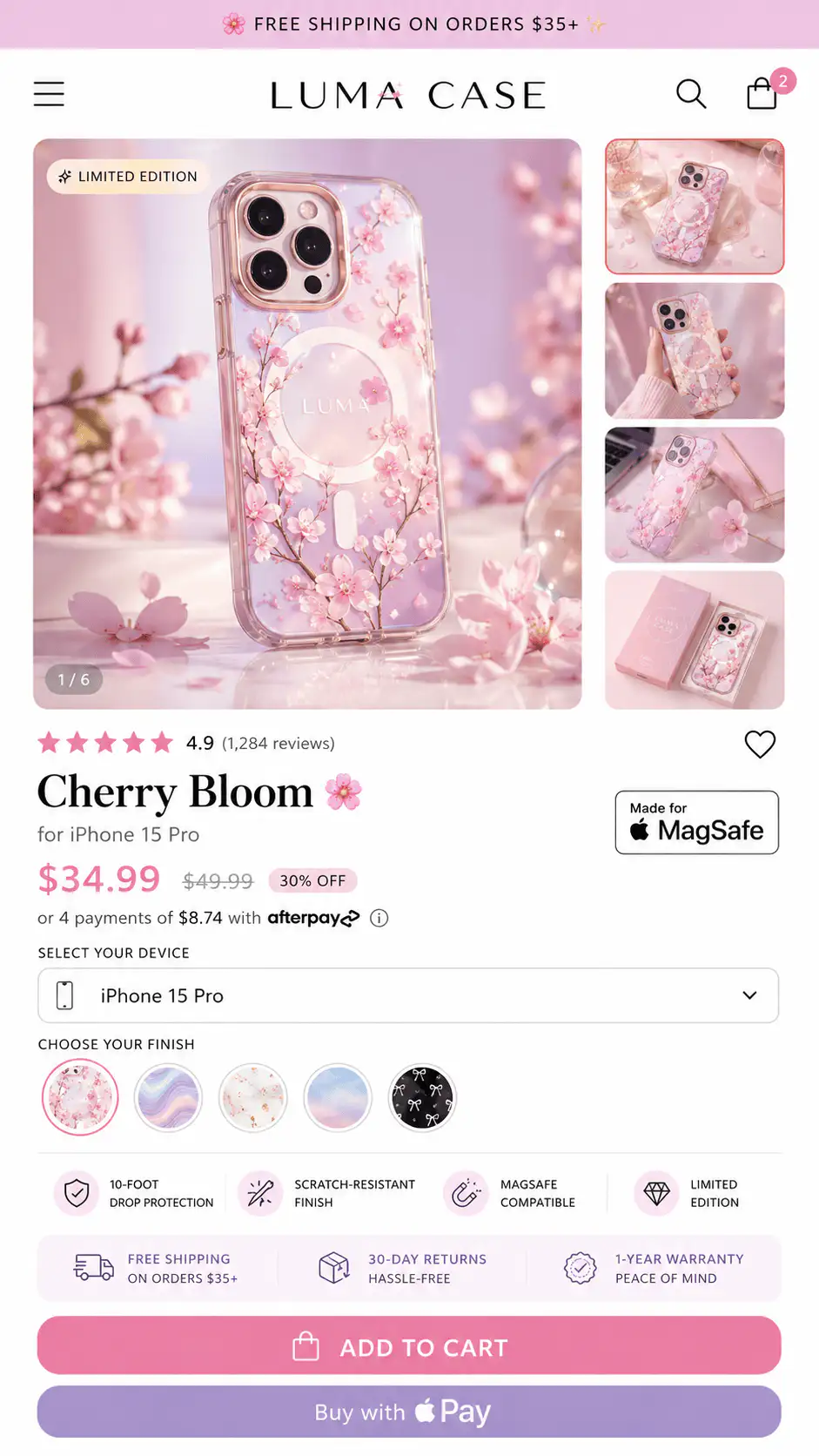
Audit the mobile page as a buyer path, not as a component list. Open the PDP on a real phone or a narrow browser, start at the top, and stop when you reach the first add-to-cart decision. Ask whether the visible content has earned that action.
- Load a top-selling product, a low-converting product, and one product with unusual options.
- Check whether the mobile product page shows the same critical detail as desktop.
- Read only the visible content before opening tabs. List every unanswered buying question.
- Open each tab and note which details should move higher.
- Check empty panels, duplicated generic tabs, broken dynamic sources, and missing metafields.
- Test after variant changes because selected options can change price, availability, copy, or proof needs.
- Repeat after theme updates, app changes, and template edits.
| Audit result | What to do |
|---|---|
| Critical detail hidden | Move a compressed version above or near the CTA |
| Useful but long detail hidden | Keep in accordion and add a visible summary |
| Tab repeats generic policy | Keep only if it reduces risk at this decision point |
| Tab is empty on some products | Hide empty rows or fix the metafield/content source |
| Desktop works, mobile fails | Check mobile CSS, app rendering, and theme template settings |
| Every product has same tabs | Split shared policy content from product-specific buying context |
What should you check after a theme or app change?
Theme and tab apps can change more than layout. They can change where description content is pulled from, whether dynamic content renders, whether a shared block applies to every product, and whether mobile panels are collapsed, clipped, or hidden by CSS.
- Does the product description appear on mobile and desktop?
- Are accordion labels visible and specific enough to earn a tap?
- Do product-specific metafields render only on the right products?
- Are empty dynamic rows hidden instead of showing blank panels?
- Do tabs load before or after the CTA, and does that order still make sense?
- Does the app add script weight or layout shift before the buy area?
- Can a screen reader or keyboard user understand and open the sections?
How should content order change by product type?
| Product type | Do not hide before confidence exists |
|---|---|
| Apparel | Fit, model size, size guide trigger, fabric feel, returns |
| Beauty and skincare | Skin type, usage expectation, ingredients concern, result proof |
| Supplements | Benefit boundary, ingredients, dosage, compliance-safe proof, subscription terms |
| Devices | What it does, compatibility, setup, warranty, support |
| Home goods | Dimensions, material, delivery, returns, care |
| Custom products | Option summary, preview expectation, production time, edit/cancel rules |
A product-tab system should flex by product type. If every PDP has the same tabs in the same order, the store is probably organizing content for the theme editor instead of for the buyer's decision.
What is the practical fix?
Do not delete every tab. Rebuild the hierarchy. Keep the first mobile sequence focused on product identity, promise, proof, choice, risk, and action. Then use accordions for the supporting depth that different shoppers may want.
- Write a short visible summary for each decision-critical tab.
- Move the top objection near the CTA or variant selector.
- Keep shared policies in accordions, but surface the relevant promise earlier.
- Use metafields for product-specific details, not generic copy pasted everywhere.
- Hide empty dynamic rows so the page does not look broken.
- QA mobile after every template or app update.
Want the mobile PDP hierarchy mapped?
If important product details are hidden, duplicated, or missing on mobile, get a Free Buying Journey First-Look. We will review the visible buying path, tabs, proof placement, and CTA sequence before you add another app.
FAQ
Are product tabs bad for Shopify mobile conversion?
Product tabs are not automatically bad. They become a problem when they hide information shoppers need before deciding: fit, compatibility, delivery, returns, materials, proof, or option guidance. Use tabs for supporting depth after the visible page answers the core buying questions.
Should Shopify product descriptions be visible on mobile?
At least the decision-critical part should be visible. A full long description can live lower or in an accordion, but the buyer should see a clear product explanation, key benefit, risk reducer, and relevant proof before the first serious CTA.
What should go in a product accordion?
Use product accordions for deeper information: full specs, full ingredient lists, care instructions, installation notes, policy details, FAQs, and brand background. Add a short visible summary when the accordion contains information that affects purchase confidence.
Why do Shopify tabs show on desktop but not mobile?
Common causes include theme settings, mobile CSS, app rendering, template differences, empty metafields, or dynamic content blocks that do not load in the mobile layout. Test a duplicate theme and compare a clean product template against the live template.
How do I know which hidden product details are hurting conversion?
Start with products that get traffic but weak add-to-cart or checkout movement. Review the mobile page without opening tabs, list unanswered buyer questions, then compare those gaps with support questions, returns, review complaints, and product-specific objections.
Sources and verification notes
- Shopify Community, No content showing on mobile product tab, retrieved 2026-07-12
- Shopify Community, Product description help, retrieved 2026-07-12
- Shopify Community, Product tabs disappearing, retrieved 2026-07-12
- Baymard Institute, Core product content is overlooked in horizontal tabs, retrieved 2026-07-12
- Shopify App Store, CI Product Tabs, retrieved 2026-07-12
- Maestrooo theme documentation, Tabs and accordions, retrieved 2026-07-12