New Shopify stores usually do not lose buyers because one magic trust badge is missing. They lose buyers because the first buying path feels unfinished: the offer is unclear, the product page does not answer risk, policies are hidden, contact proof is weak, and mobile shoppers hit friction before checkout.
- A new Shopify store should prove legitimacy before scaling paid traffic.
- Trust is built from visible basics: product clarity, policies, contact paths, delivery expectations, reviews or proof substitutes, and working mobile UX.
- No-review stores can still reduce risk with transparent policies, real founder context, detailed product proof, and honest support access.
- Check the first path from ad or homepage to PDP, cart, and checkout before changing budgets.
Before buying ads, a new Shopify store should fix the signals that help a first-time visitor decide the store is real, the product is clear, and the order is low-risk. That means a homepage or landing screen that says what the store sells, product pages with specific benefits and images, visible shipping and return information, real contact details, working policy pages, payment reassurance, mobile speed, and a checkout path that does not reveal surprise costs too late. Paid traffic can show whether the offer has demand, but it cannot repair a store that feels unfinished. If visitors already arrive and do not buy, audit the buying path before increasing spend.
New Shopify stores often treat ads as the moment the business starts. The store is technically live, the pixel is installed, and the first campaign sends visitors. Then the dashboard shows sessions, maybe a few add-to-carts, and very few orders.
That is not always a traffic problem. In public Shopify Community threads from 2026, new merchants keep asking the same version of the question: visitors are arriving, but buyers do not trust the store, understand the offer, or feel safe enough to complete the order. That pattern should be fixed before more cold traffic is pushed into the same path.
What is the minimum trust system for a new Shopify store?
The minimum trust system is the set of visible cues that make a cold buyer believe the store is legitimate and the order will go as expected. It is not one badge. It is the way the whole page answers small doubts before they accumulate.
| Trust checkpoint | Buyer question | What should be visible |
|---|---|---|
| Store identity | Who is behind this? | Clear brand promise, About page, real contact route |
| Product clarity | What am I buying? | Specific product name, use case, images, benefits, specs |
| Risk | What if it is not right? | Returns, exchanges, guarantee, support response path |
| Delivery | When will it arrive? | Shipping cost, delivery range, processing time, free-shipping threshold |
| Proof | Has anyone else trusted this? | Reviews, UGC, press, founder proof, product details, real photos |
| Mobile path | Can I buy without fighting the page? | Fast load, readable PDP, reachable CTA, clean cart |
For a new store, the standard is not perfection. The standard is that a reasonable first-time buyer does not have to hunt for basic reassurance.
How should the first screen prove the store is real?
The first screen should make the category, product promise, and next path obvious. If a visitor lands on the homepage, they should know what you sell, who it is for, and why the store is different before they scroll. If they land on a product page, they should immediately understand the product and the reason to continue.
- Use a headline that names the product category or buyer outcome.
- Show the product clearly instead of hiding it behind lifestyle-only imagery.
- Make the primary collection or product path obvious.
- Avoid empty collections, duplicate menu items, broken links, and placeholder content.
- Put one credibility cue near the first decision area: review count, guarantee, founder note, delivery promise, or real product detail.
What should every product page answer before ads scale?
Shopify's own product-page guidance frames product pages as the place where shoppers need enough information and reassurance to make a purchase decision. For a new store, that means the PDP has to do more than show price, variants, and an Add to Cart button.
- What the product is, in plain language.
- Who it is for and what problem or desire it serves.
- What makes it different from a marketplace alternative.
- What the buyer gets in the box or order.
- What size, color, material, ingredient, compatibility, or care details matter.
- What proof supports the claim.
- What happens after purchase: shipping, returns, exchanges, support, and payment.
Supplier-style descriptions are a common leak. They list features but do not tell the buyer why those features matter. Rewrite the page around buyer objections: Will it fit? Will it last? Is it safe? Does it look like the photos? Can I return it? Is this store legitimate?
What if the store has no reviews yet?
A new store may not have customer reviews, and fake reviews are worse than no reviews. The practical answer is to use proof substitutes until real buyer feedback exists.
| Missing proof | Use this instead | Why it helps |
|---|---|---|
| No reviews | Founder note, product rationale, support promise | Shows accountability |
| No UGC | Real product photos, scale shots, packaging, detail images | Reduces uncertainty |
| No press | Clear product specs and comparison context | Lets buyers judge the product |
| No social proof | Transparent policies and contact details | Shows the store is reachable |
| No purchase history | Small launch offer or guarantee | Reduces first-order risk |
The goal is not to pretend the store is bigger than it is. The goal is to remove the red flags that make a buyer feel like nobody is accountable after the payment clears.
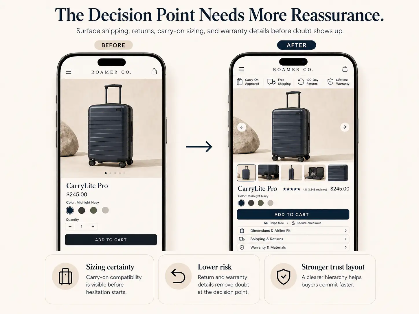
Where should shipping and return reassurance appear?
Shipping and returns should not live only in the footer. Baymard's cart and checkout research consistently points to extra costs, delivery timing, return uncertainty, trust, and checkout friction as abandonment causes. Those concerns start before checkout.
- Show shipping thresholds or delivery ranges near the Add to Cart area.
- Explain returns or exchanges in one short line close to the buying section.
- Link to full policy pages from the PDP and cart.
- Avoid surprising the buyer with shipping cost for the first time at checkout.
- Use plain policy language; do not make buyers decode legal copy during a purchase decision.
If your shipping terms vary by region or product, say that clearly. Vague reassurance like 'fast shipping' is weaker than a realistic delivery range and a visible support path.
How should contact and policy pages be checked?
A first-time buyer may never open the Contact page, but its existence matters. The same is true for About, Shipping, Returns, Privacy, and Terms pages. They are confidence anchors: buyers want to know there is a real store behind the checkout.
- Click every footer policy link on mobile and desktop.
- Remove placeholder policy text and conflicting delivery promises.
- Add a support email or form that looks actively monitored.
- Make refund and exchange timing specific.
- Check that social links, WhatsApp links, and email links open correctly.
- Remove duplicate navigation items and empty collection paths.
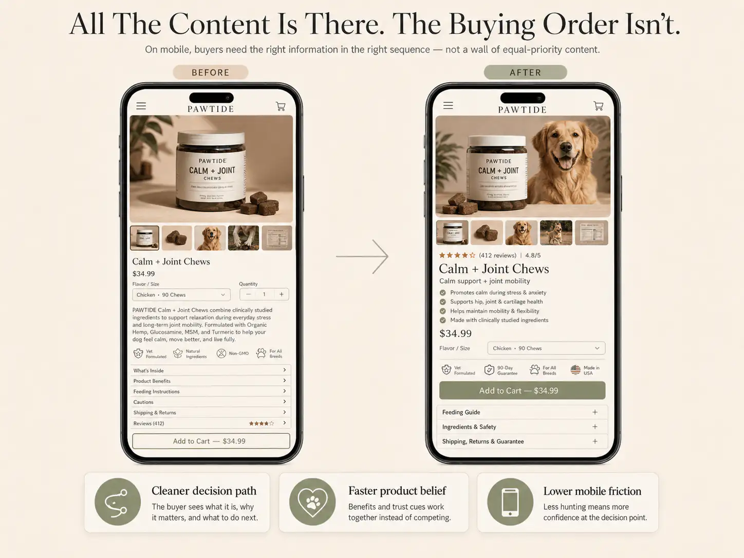
What mobile issues should be fixed before traffic?
Most early ad traffic is mobile-heavy. That makes mobile trust a conversion issue, not a polish issue. A store can look acceptable on desktop and still feel broken on a phone if the page is slow, popups cover the product, variants are hard to tap, or the CTA disappears below long content.
- Compress heavy product and hero images.
- Remove popups that appear before the buyer understands the offer.
- Check tap targets for menu, variants, cart, and checkout buttons.
- Make price, variants, shipping cue, and CTA reachable without hunting.
- Test the full order path on a real phone, not only a desktop responsive preview.
- Remove apps and scripts that do not directly help the buying decision.
When should a new Shopify store start buying ads?
A new Shopify store can start buying ads when the first buying path is complete enough to learn from traffic. That does not mean the store must be fully optimized. It means the obvious trust blockers are gone and the ad test can answer a real demand question instead of exposing unfinished basics.
| Signal | Do not scale yet | Ready to test |
|---|---|---|
| Homepage or entry page | Unclear product category or empty first screen | Buyer knows what is sold and where to click |
| Product page | Supplier copy, weak images, hidden policies | Product, benefit, proof, risk, and CTA are clear |
| Trust basics | No contact route, placeholder policies, broken links | Contact, About, shipping, returns, and payment cues work |
| Mobile | Slow, cluttered, overlays block action | Phone path from entry to checkout is clean |
| Analytics | No order/event visibility | Sessions, add-to-cart, checkout, and purchase are trackable |
Once those basics pass, small paid tests can be useful. They can show whether the offer, product, audience, and creative have traction. But if the store fails the trust checklist, paid traffic mostly tells you that strangers do not want to take risk on an unfinished store.
What should be checked after the first traffic test?
After the first ad or traffic push, read the funnel by buyer confidence, not only by channel performance. The useful question is where the visitor had enough intent to continue and where the page stopped making the next step feel safe.
| Symptom | Likely trust leak | First check |
|---|---|---|
| High bounce | Entry promise mismatch or slow mobile load | Ad-to-page message and first screen |
| PDP views, low add-to-cart | Product value or risk unclear | Images, copy, proof, variants, CTA |
| Add-to-cart, low checkout | Cart cost or reassurance gap | Shipping, delivery, returns, cart clarity |
| Checkout reached, no orders | Payment, total cost, delivery, or support doubt | Wallets, fees, policy visibility, checkout errors |
| Good traffic, no engagement | Wrong audience or weak offer | Creative promise, landing path, product-market fit |
Before buying more traffic, audit the trust path
If your new Shopify store is getting visitors but not orders, get a Store Autopsy pass before scaling ads. We will check the first screen, PDP trust signals, policies, mobile path, cart, and checkout confidence.
FAQ
Can a new Shopify store convert without reviews?
Yes, but it needs other trust signals. Use real product photos, clear policy pages, visible contact details, founder context, detailed product information, delivery expectations, and a straightforward return or exchange promise until real customer reviews exist.
Should I run ads before my Shopify store has sales?
Small tests can help validate demand, but do not scale ads into an unfinished store. First check that the entry page, product page, policies, contact details, mobile flow, cart, and checkout path remove obvious first-time buyer hesitation.
Are trust badges enough for a new Shopify store?
No. Payment icons can support confidence, but they do not replace real trust. Buyers also need to understand the product, see clear shipping and return terms, know how to contact support, and believe the store will handle the order properly.
What is the fastest trust fix for a new store?
The fastest fix is usually making shipping, returns, contact, and product clarity visible near the buying decision. A strong PDP with clear images, benefits, policies, and support cues often beats adding another generic badge or popup.
How do I know if the issue is traffic quality or store trust?
Compare behavior by source and stage. If visitors from multiple sources reach product pages or carts but do not continue, inspect store trust and buying-path clarity. If one channel bounces quickly with little engagement, check audience, creative promise, and landing-page match.
Sources and verification notes
- Shopify Community, new store conversion discussion, retrieved 2026-07-04
- Shopify Community, traffic but no sales store feedback discussion, retrieved 2026-07-04
- Reddit r/shopify, small brand Shopify expert discussion, retrieved 2026-07-04
- Shopify, product page optimization advice, retrieved 2026-07-04
- Baymard Institute, cart abandonment rate research, retrieved 2026-07-04
- Shopify Enterprise, reducing cart abandonment, retrieved 2026-07-04